Difference between revisions of "GUI Basics"
| Line 253: | Line 253: | ||
==Undocking, Popping out== | ==Undocking, Popping out== | ||
| − | Tabs can be undocked (panels remain on the layout) or popped out (panels are opened in a new browser window). | + | Tabs can be undocked (panels remain on the layout) or popped out (panels are opened in a new browser window). In order to allow undocking and popping out, the '''Allow Undocking''' option in the tab configuration menu |
Note: closing a popped out window does not delete it - it is returned to the tab (or undocked window if it was undocked prior to popping out) | Note: closing a popped out window does not delete it - it is returned to the tab (or undocked window if it was undocked prior to popping out) | ||
==Blinking Tabs== | ==Blinking Tabs== | ||
Revision as of 05:23, 8 April 2021
Windows
In AMI, windows are the building blocks of layouts. Windows are highly customizable and entire complex layouts can be built within one window. This section will discuss the various options you have when starting out with a window.
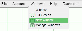
The Windows option can be found on the top menu bar. Developers have the option of creating and managing windows whereas end-users are still able to use the menu to view a list of windows that are in the layout.
Renaming Windows
Once created, Windows can be renamed by double clicking on the Window name or by using the Configure Window found in the middle of the Window header.
Popping out, Minimizing, Maximizing, and Deleting Windows
Using the buttons found on the right side of the window header, you can pop out a window (into its own window), minimize, maximize, or delete a window.
![]() :
pops out the window its own window. When you close a popped out window, it will return the window onto the dashboard (it will not be deleted). The status of the window will be shown as [popped out] in the Windows menu.
:
pops out the window its own window. When you close a popped out window, it will return the window onto the dashboard (it will not be deleted). The status of the window will be shown as [popped out] in the Windows menu.
![]() : minimizes the window. Minimized windows can be accessed by selecting them from the Windows menu.
: minimizes the window. Minimized windows can be accessed by selecting them from the Windows menu.
![]() : maximizes the window or restores a maximized window to its original size.
: maximizes the window or restores a maximized window to its original size.
![]() : deletes the window. Windows in use will require confirmation before being deleted.
: deletes the window. Windows in use will require confirmation before being deleted.
Note: in order to delete individual panels within windows, use the configuration button menu of the panel and select Delete Highlighted Panels. If the window does not have any panels, selecting this option will delete the window.
Resizing and Moving Windows
In order to resize a window, click and hold any part of the edges or corners of the window. While holding the mouse button, drag the cursor to resize the window
In order to move a window around the dashboard, click and hold the window header. While holding the mouse button, move the window to any area of the dashboard.
The Configure Window menu found in the window header contains a lot of options to be used for the windows. The options to be discussed in this section are Type and Location in Menu Bar.
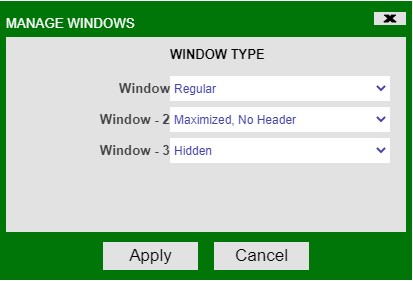
Type
Maximized, no Header: maximizes the size of the window and removes the window header. The Configure Window button will still be visible when in developer mode.
Regular: the default state of windows with all window header buttons available.
Hidden: hides the name of the window from the Windows drop down menu when not in developer mode. When in developer mode, the name of the window will be visible with a [hidden] label. This is useful when creating windows that will be kept minimized or behind other windows and only available when taking a certain action.
You can also use the Manage Windows option in the Windows menu in order to get an overview of all of the windows in the layout and apply a configuration to each.
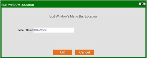
Location in Menu Bar
If you would like to place a window under its own menu item in the menu bar, use the Location in Menu Bar option to assign a Menu Name. The menu item will then appear when not in developer mode (and the window is not hidden):
The window will list appear in the Windows menu:
Dividers
As a layout is made of a window or multiple windows, a window is made of a panel or multiple panels. Dividers allow you to take a single window and subdivide it as you see fit to best visualize your information.
Adding Panels
There are two ways to create dividers/divide a window into panels:
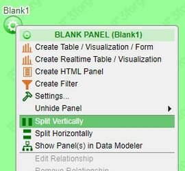
The first way to divide a window is using the Split Vertically and Split Horizontally found in the panel configuration menu (also known as the Green Button).
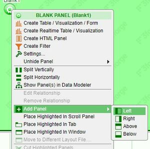
The second way to divide a window is to actually create panels using the Add Panel option also found in the panel configuration menu.
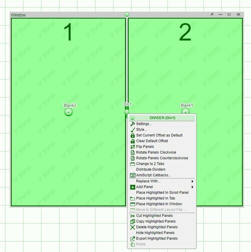
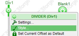
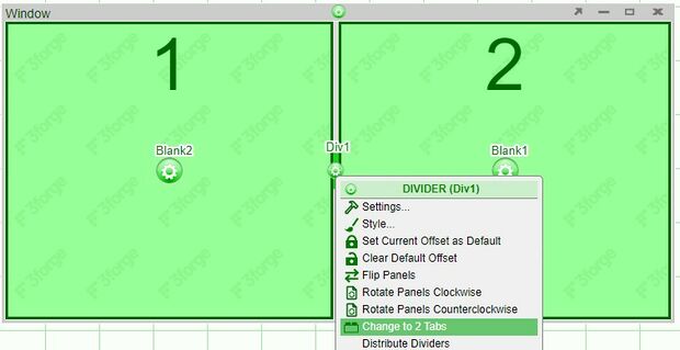
Both options lead to the creation of dividers with their own set of options. Dividers, by default, can be dragged by the user to adjust the real-estate of the two panels they divide. In order to further modify the window, use the divider configuration button found on the divider itself. Opening the configuration menu will highlight the associated panels and numbers will be assigned to each panel.
| Settings | Includes the option to change Panel ID, User Preferences ID, and Default Offset |
| Style | Includes both styling and behavior options for the dividers |
| Set Current Offset as Default | Sets the offset of the divider as the default. Reopening/rebuilding the layout will place the divider at this position |
| Clear Default Offset | Clears the divider position set |
| Flip Panels | Flips the position of the panels |
| Rotate Panels Clockwise | Rotates the selected panels in a clockwise direction |
| Rotate Panels Counterclockwise | Rotates the selected panels in a counterclockwise direction |
| Change to 2 Tabs | Removes the divider and places each of the panels in a tab |
| Distribute Dividers | Evenly distributes the dividers |
| Replace With... | Replaces the panels with a different visualization or blank panel |
| Add Panel | Add a blank panel left, right, above, or below |
| Place Highlighted in Scroll Panel | Places the selected panels in a scroll panel |
| Place Highlighted in Tab | Places the panels in tabs |
| Place Highlighted in Window | Places the panels in a new window, leaving behind a blank panel in their place |
| Move to Different Layout File... | When working with multiple layouts - moves selected panels to a different layout |
| Cut Highlighted Panels | Cut the panels for pasting to a different panel |
| Copy Highlighted Panels | Copies the panels for pasting to a different panel |
| Delete Highlighted Panels | Deletes the selected panels |
| Hide Highlighted Panels | Hides the selected panels. To unhide, use the Unhide Panel option in the panel configuration menu |
| Export Highlighted Panels | Export the highlighted panels, as text, for use in another dashboard |
| Paste | Paste the cut/copied panel(s) |
Examples
Adding panels
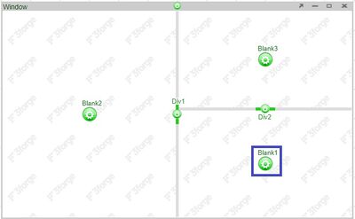
Adding a panel above using the right panel configuration button adds a panel only above the right panel:
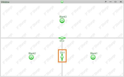
Adding a panel above using the divider configuration button adds a panel above both panels:
Modifying Dividers
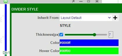
The options to modify dividers are all found in the divider's Style setting.
Style
Adjusting Size and Color
Under the Style section of the Divider Style menu, you can adjust the thickness of the divider, the color of the divider, and the color of the divider when the mouse is hovering over it. Note: To make a divider invisible, change the thickness to 0(px).
Behavior
Locking Dividers
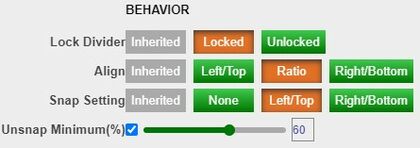
Dividers may be locked in order to prevent it from moving when not in developer mode. A small lock will appear over the divider configuration button
Alignment
The Align options keeps the size of the panels consistent when resizing the windows. For example, when set to the Ratio option, resizing a window consisting of two panels will keep their sizes relatively similar to their original sizes.
Snapping
When enabled, the Snap Setting allows you to collapse a divider by double clicking on it. Depending on the setting used, the panel to the left, right, top, or bottom will be collapsed.
Note: when a panel is snapped away, it is considered hidden. This will affect the behavior of the panel when it is a real-time table. The real-time table will have a On-Hidden Behavior setting.
Unsnap minimum(%): when set, the divider will return to at least that % position of the window. For example: if the unsnap minimum is set to 60%, and the the divider was dragged to 40%; snapping and then unsnapping the divider will return the divider to the 60% location
Tabs
Tabs can be used to organize and increase the real-estate of dashboards. Through the use of tabs, you may be able to break down a layout into multiple components or even build entire layouts in a single tab. The creation of tabs differs depending on which panel or divider configuration button is used.
Creating Tabs
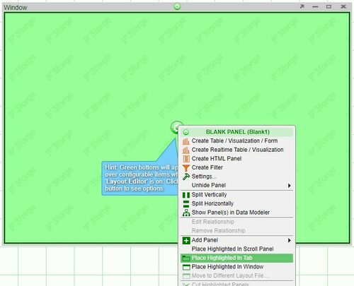
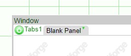
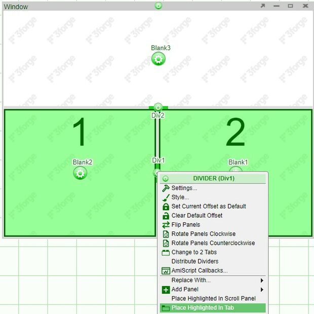
In order to place a single panel into a tab, click on the configuration button of the panel and select Place Highlighted in Tab
If the window consists of 2 or more panels, they can be separated into 2 tabs or can be placed into one tab.
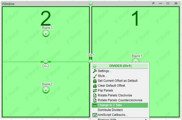
To place the panels into 2 separate tabs, select Change to 2 Tabs from the divider configuration menu
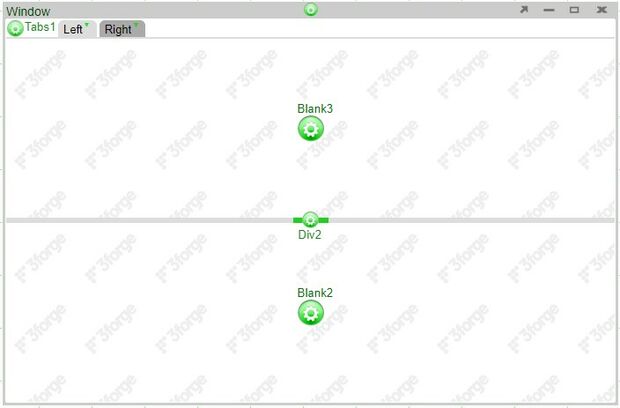
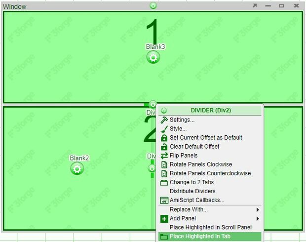
Note: even if a panel is subdivided into multiple panels (such as the panel labeled 2below), it will still place the panel into one tab; it will not become 3 tabs.
To place multiple panels or the entire window into a single tab, choose the divider configuration button which highlights the desired panels and select Place Highlighted in Tab from the menu.
Adding, Editing, Moving, and Deleting Tabs
Adding New Tabs
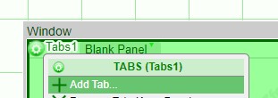
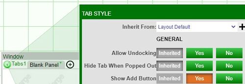
To add additional tabs, click on the tab configuration button and select Add Tab. You can also enable the Show Add Button option in the Style menu.
Tab dropdown menu
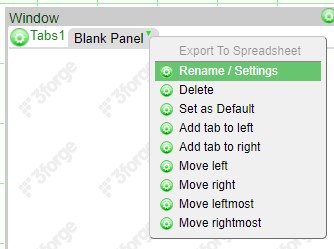
Another way to add tabs is to use the tab dropdown menu. This menu is located on each tab and is opened by clicking on the downward pointing green triangle. This menu contains all of the ways of modifying tabs - renaming, deleting, adding, and moving. This menu allows the addition of tabs to either the left or the right of the selected tab.
Export to Spreadsheet: downloads the tables within a tab as a spreadsheet. If you have multiple table panels, these panels will be shown as separate tabs in the spreadsheet. You can disable this option by using the tab configuration menu (Hide Export Spreadsheet Menu Item)
Moving Tabs
If you have to move the tabs around, use the tab dropdown menu of the tab you would like to move and use one of the four options (move left, right, leftmost, or rightmost) until you get the tab to where you would like it to be
Renaming Tabs
In addition to the tab dropdown menu, the tab settings menu can be brought up by double clicking on a tab. This menu also includes the options to select colors for the tabs
Deleting Tabs
Tabs can also be deleted by deleting all of the panels within a tab. If there are multiple panels, select the divider that will highlight all of the panels.
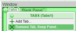
When you are left with a single tab, you can also use the Remove Tab, Keep Panel open in the tab configuration menu in order to revert the panel to a regular window
Setting Default Tabs
If you would like a specific tab to be the primary tab that is seen when a layout is opened, use the Set as Default option from the tab dropdown menu. This tab will then be opened regardless of which tab is last opened when the layout is closed.
When making complex layouts, you may end up with so many tabs that it won't be able to fit on the list of tabs. When the number of tabs exceed the space, control arrows will appear at the rightmost edge. You can use these control arrows to scroll through the tabs.
To quickly get to a tab, hover over the tabs and use the mouse scroll to scroll the tab space (much like scrolling down a webpage) and select the desired tab.
Undocking, Popping out
Tabs can be undocked (panels remain on the layout) or popped out (panels are opened in a new browser window). In order to allow undocking and popping out, the Allow Undocking option in the tab configuration menu
Note: closing a popped out window does not delete it - it is returned to the tab (or undocked window if it was undocked prior to popping out)
