GUI Tables
Real-time Tables & Heat Maps
There are two main types of visualizations in AMI. Real-time visualizations and static (datamodel-based) visualizations.
Real-time panels connect directly to the AMI Real-time Database (AMIDB) and display data as it is updated in the database. With real-time panels, there is no need to refresh as any update is immediately pushed to the visualization.
There are three different types of real-time visualizations: tables, aggregate tables, and heat maps.
Tables
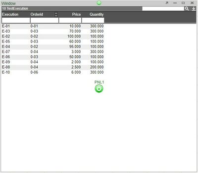
Real-time tables are useful when it is necessary to get a tabular view of the data that is being pushed to the AMI real-time database or to view the changes that are being made to the existing data. Tables can be modified in order to best present the data (discussed in the Columns section).
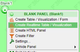
To create a real-time table, click on the green configuration button on a blank panel and select Create Realtime Table/Visualization from the menu. This will open up the real-time visualization wizard.
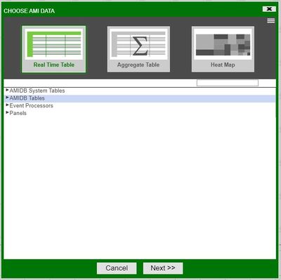
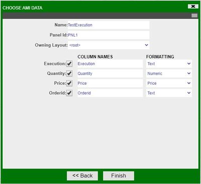
Expand the AMIDB Tables tree, select the table you would like to build the table and click next. In the last step of the wizard, modify the table if any changes are necessary. Click Finish to build the table.
Aggregate Tables
Aggregate tables are real-time tables that can be used to obtain a summary of data grouped by certain variables. Aggregate tables will integrate changes to the data in real-time.
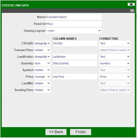
To create a real-time table, click on the green configuration button on a blank panel and select Create Realtime Table/Visualization from the menu. This will open up the real-time visualization wizard. In the wizard, select the Aggregate Table icon and the data you would like to aggregate. Click Next to view the aggregation options.
In the last step of the wizard, choose the variables to Group By (or hide) and the variables to perform aggregations on. The types of aggregations available are: Count, Sum, Max, Min, & Average. Click Finish to create the aggregate table.
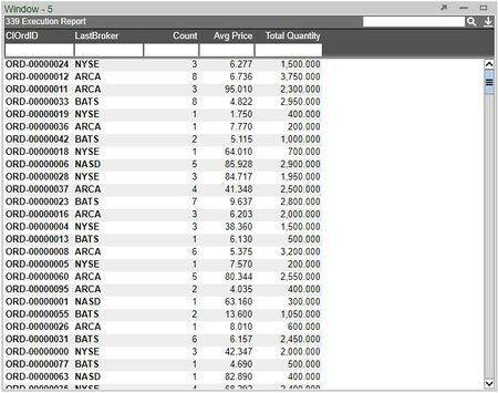
The group by columns will be in bold.
Aggregate Table Settings - Grouping Columns for Aggregation
A unique setting found in aggregate tables is the option to choose how hidden grouping columns affect the aggregation.
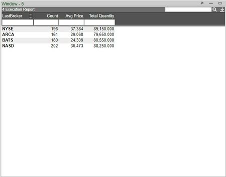
When set to Hidden and Visible, the table will consider all grouping columns (including hidden columns). When set to Only Visible, hidden grouping columns will not affect the aggregation.
This is useful when you would like to temporarily change the aggregate view without deleting any grouping columns.
The aggregate table when set to Only Visible and CIOrdID is hidden
Heat Maps
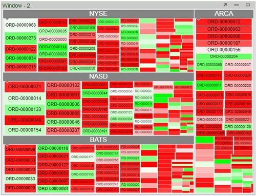
Real-time heat maps are real-time graphs which allow the user to visualize the data using different colors and sizes; enabling a quick interpretation of large amounts of data. Various colors can be assigned to a range of values.
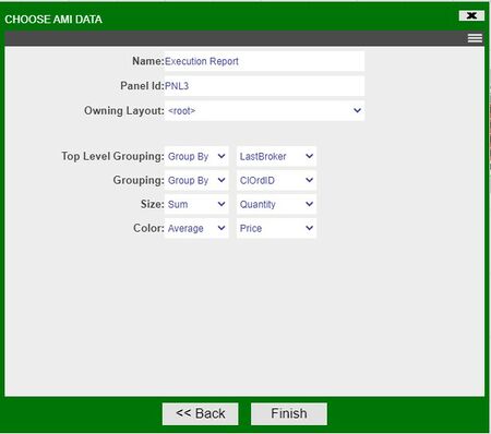
To create a real-time heat map, click on the green configuration button on a blank panel and select Create Realtime Table/Visualization from the menu. This will open up the real-time visualization wizard. In the wizard, select the Heat Map icon and the data you would like to use. Click Next to view the heat map options.
In the last step of the wizard, choose the variables to use for Top Level Grouping, Grouping, Size, and Color. Click Finish to create the heat map.
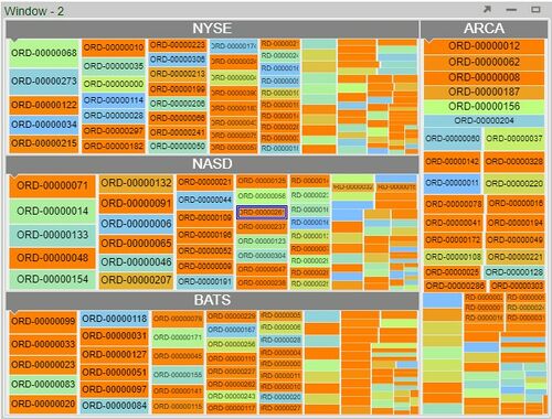
A heat map with preset colors will be created. In order to make any adjustments to the heat map style, such as the gradient colors used for the nodes, select Style from the panel configuration menu. Click on the Color Gradient field (found under Nodes) to assign different colors to various points in the range.
Three points chosen on the range with three different colors
Note: you can hit Space to cancel zoom.
Static Panels
Static panels render data from one or more datamodels. Please refer to the Data Modeler section of the GUI Tools documentation in order to get a better understanding on the use of the data modeler and the creation of datamodels before using static visualizations.
Static Tables
Static tables (and heat maps) are not vastly different from their real-time counterparts and much of what applies to real-time tables applies to static tables. The datamodel and its settings will determine what is pushed to the static visualizations. A major difference between real-time and static visualizations is that static visualizations can be inherited through the use of included layouts, whereas real-time tables will not (please refer to the Included Layouts section of the GUI Tools documentation for more information on the use of included layouts).
Trees
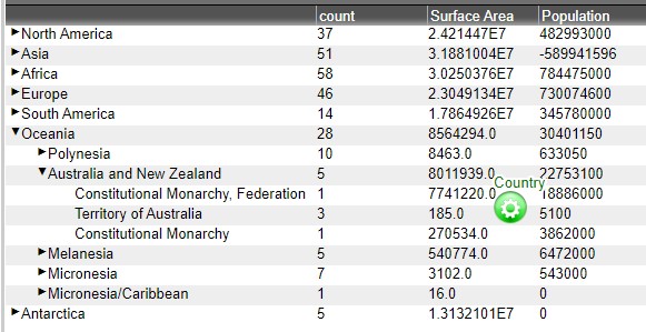
Static trees provide a tree view of the data from a datamodel. The data is grouped and aggregated by one or more fields.
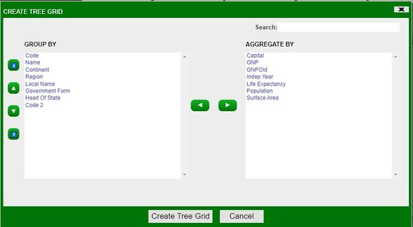
To create a tree based on a datamodel, select Tree Grid in the static visualization selection window of the Visualization Wizard.
In the Create Tree Grid window, select the columns to Group By and the columns to Aggregate By. Each column in the Group By section will be used for a level in the tree, which the very top column being used for the highest level. Click on Create Tree Grid to finalize the tree creation in the visualization wizard.
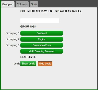
To modify any of the groups, use the Grouping tab on the left. In the following example, Grouping 1 will be the highest level of grouping with Grouping 3 the lowest level of grouping.
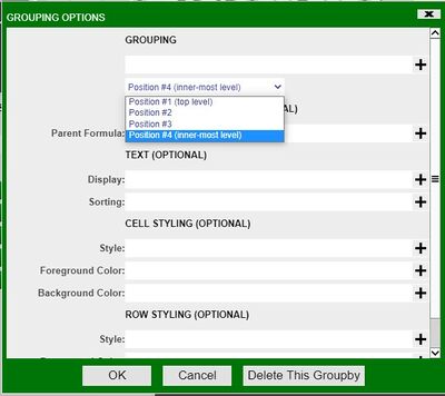
To add any other level of grouping, click on the <Add Grouping Formula> button. In the Grouping Options window, the position of the grouping can also be modified (also applies to the groupings that have already been created).
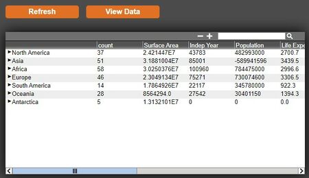
Whenever any changes are made in the visualization wizard and you would like to preview it, click on the 'Refresh button. Click Finish to create the tree.
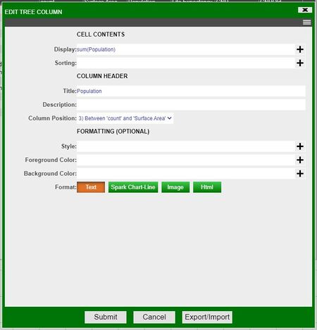
The default aggregation is sum; to modify the aggregation, click on the column of the variable to be used and make the necessary changes in the Display field of the Edit Tree Column window.
Leafs
The default setting on tree tables is to not show the leafs.
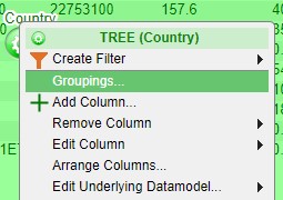
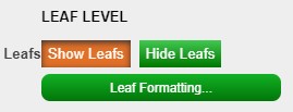
To view the leafs, select Groupings from the tree's configuration menu (green button). In the Tree Grid Settings, click on Show Leafs and then click on the Leaf Formatting button that shows up.
In the Leaf Options window, use the Display field to select the variable to be used as the leaf. In this example, it will be Name. After making the necessary changes, click Submit on the Tree Grid Settings window to implement the changes.
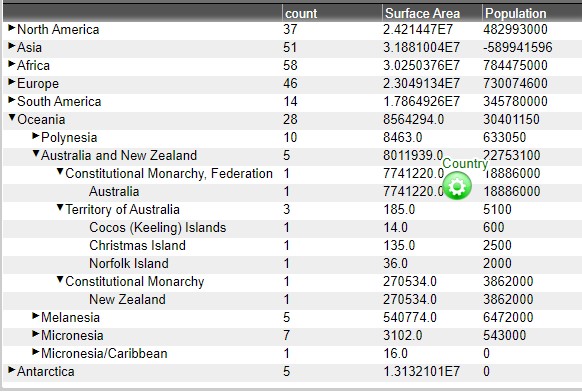
Compared to the tree table before, you are now able to see the members of the Government Form level.
Columns
Adding, Editing, Copying, & Deleting Columns
Adding
(Note: these options are only available when in developer mode)
There are three ways to add columns in tables
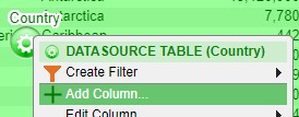
1. Click on the green button to bring up the panel configuration menu and select Add Column
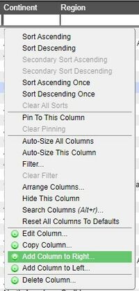
2. Click on a column to bring up the column menu. This method allows you to place the new column in between existing columns. In the menu, select whether to add the new column to the right or left of the selected column
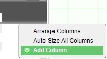
3. Click on an open area of the header in order to bring up the header menu. In the menu, select Add Column.
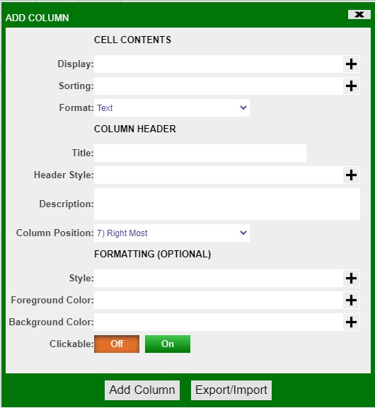
Add Column menu
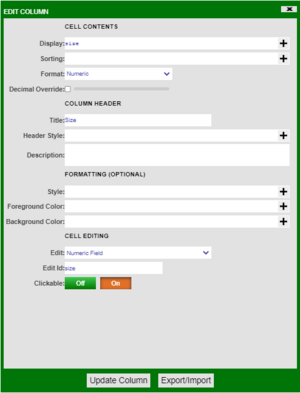
| Display | Use variables, operators, functions, and icons to create the content for the column |
| Sorting | Use variables, operators, and functions to apply a sorting to the contents of the column |
| Format | Choose the format of the column (e.g.: text, numeric, time, date, price, etc.) |
| Tooltip | Create a tooltip for cells users hover over |
| Title | Create a title for the new column. Must be unique from existing columns. |
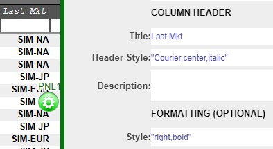
| Header Style | Apply different fonts, alignments, style, and colors to the column header |
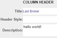
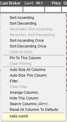
| Description | Add a description/help which can be seen when clicking on the column header |
| Column Position | Drop down list of various positions where the new column can be placed (can also be hidden) |
| Style | Apply a style to the contents of the column (including font and alignment) |
| Foreground Color | Apply a color to the contents of the column |
| Background Color | Apply a background color to the column |
| Clickable | Makes the contents of the column clickable |
Examples
Adjusting header and column styles
Column Description
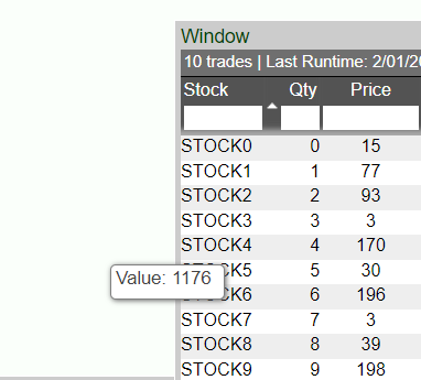
Tooltip
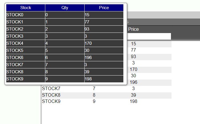
Can also render HTML in the tooltip. Below shows a table that can be rendered through html in the tooltip. Make sure that you place your HTML in quotes in the tool tip field. You can place more complicated logic in custom methods to render tables in html such as below in the tooltip.
Editing
There are two ways to edit columns
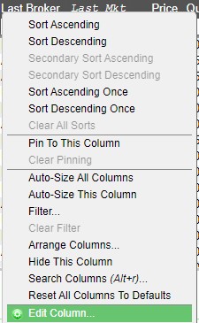
1. Click on the header of the column to bring up the column menu and select Edit Column
2. Click on the green button to bring up the panel configuration menu. Highlight Edit Column to bring up the list of columns and select the column
Both options will open the Edit Column window, which is the same as the Add Column window.
Example
Conditional Formatting
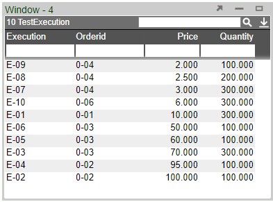
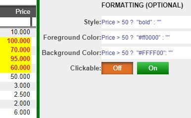
Formatting can be used to highlight data in specific formats when certain parameters are met. In this example, the Price is set to be in bold red and highlighted if it is greater than $50.
The onEdit Callback
This callback is triggered whenever a value in the table is edited and then saved. This does not trigger if the value is the same as its original state when saved; if the value has been changed and then reverted to it's original state before being saved it will not trigger.
Two tables are returned when triggered, vals and oldVals.vals contains the latest version of the edited cells while oldVals contains the original values before being saved.
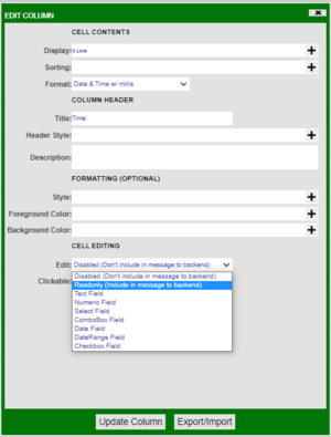
The values stored inside these tables are defined using the edit column menu. The menu can be accessed by left clicking the header of a column and choosing the edit column option from the dropdown box as shown above. Looking at the cell editing section of this menu allows the user to define how they want this column's data to be accessible to the user.
Example
At the bottom of the menu there is an option labelled clickable, when this is set to On the user will be able to double click cells in this column and edit them in real-time. The data in the table backing the table visualisation will only be changed if the user has written a specific script to do so.
There are multiple options available, the readonly option allows the user to include the value of the cells in the vals and oldVals tables. The other options define the datatype of the new value that is entered into the edited cell, this datatype must match the original type of the cell.
Copying
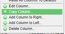
In order to copy a column, click on the column to be copied and select Copy Column. This will bring up the Edit Column menu. Apply a different name and click Update.
Note: if the column to be copied has any input in its fields, those fields will also be copied.
Deleting
There are two ways to delete a column.
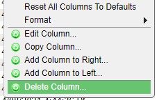
1. Click on the column header and select Delete Column from the column menu. There will be a confirmation prompt before final deletion.
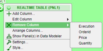
2. Click on the green button to bring up the panel configuration menu. Highlight Remove Column to open a list of all the columns in the table. Select the column to remove.
Sorting
Columns can be sorted in multiple ways
Primary Sorting
Primary sorting will remain in place until it is cleared. Any new data added to the table will automatically be sorted. There are two ways to add a primary sort to a column.
1. Click on a column to open the column menu. Select either Sort Ascending or Sort Descending
2. Hover over the column header - this will bring up the sorting arrows on the right side of the header. Clicking on the up arrow will apply a sort in ascending order & clicking the down arrow will apply a sort in descending order
After applying a primary sort, the corresponding arrow indicating the type of sort will appear in the header
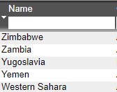
Application of a descending sort
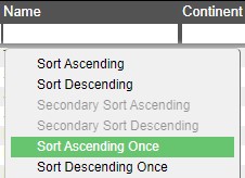
In order to cancel a primary sort on a single column, use the Sort Ascending Once or Sort Descending Once options from the column menu. This will perform a sort which will not remain in place and the primary sort will no longer be applied to the column.
Secondary Sort
Secondary sort can be used to further sort the data based on multiple columns. The secondary sort option will not be available unless there is a primary sort in place on one of the columns.
Example
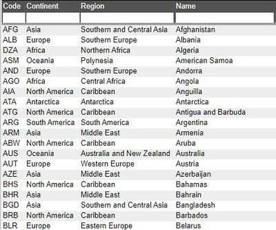
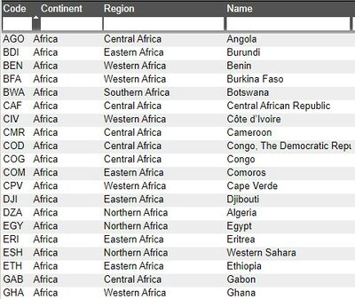
Table without any sorting applied
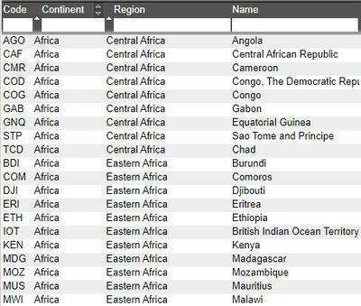
Sort Ascending applied to Continent
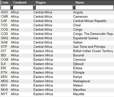
Secondary Sort applied to Region
Secondary Sort applied to Name
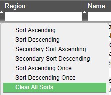
In order to clear all of the sorts on a table, click on any column and select Clear All Sorts from the column menu.
Pinning & Sizing
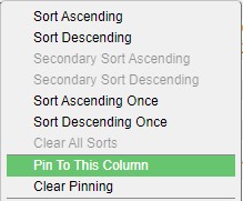
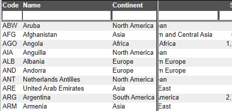
When working with large tables, it may be necessary to keep certain columns pinned. To do this, select the column to be pinned and select Pin To This Column. That column and every column to the left will be pinned.
The header of pinned columns will be in bold and a vertical line will appear as you scroll to the right of the table.
Use Clear Pinning to clear all pinning.
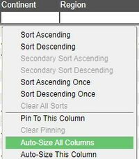
You may manually resize columns or have it done automatically. To resize any column, hover over either edge of the header, click and drag to the desired size. To have this done automatically, using the width of the longest record(s) in the column(s), select Auto-Size This(All) Column(s) from the column menu.
You can also click on an open area of the header in order to bring up the header menu. In the menu, select Auto-Size All Columns
Filters
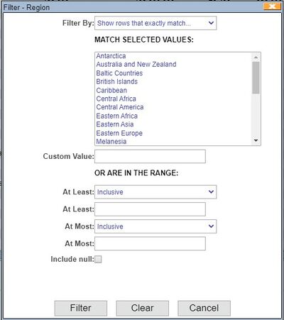
To apply a filter to a column, click on the column header and select Filter from the column menu. This will open the Filter window.
| Filter By | Drop down list to determine whether or not to show/hide based on exact/pattern match |
| Match Selected Values | List of all of the unique records in the column. Select or more records to filter on. |
| Custom Value | Input specific value to filter on (may be a record that is not in the column yet) |
| At Least | Include or Exclude record in the At Least field |
| At Least | Input specific value to be the minimum |
| At Most | Include or Exclude record in the At Most field |
| At Most | Input specific value to be the maximum |
| Include null | Check to include null |
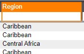
When a filter is applied, the column header will be highlighted in orange.
Quick Filters
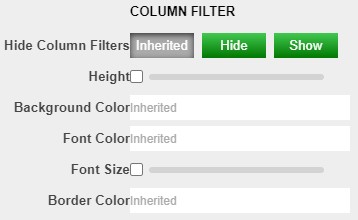
A faster way to apply filters to a column is to use filter fields (quick filters) in the column headers. Quick filters are on by default but you may disable this in the panel's Style menu (panel configuration menu > Style > Column Filter). You may adjust the style of the filters using the same menu.
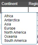
When you click on a quick filter field, a autocomplete list will open. This will be a list of all of the unique records that are in the column. Select a record to apply a filter based on that record.
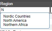
You can also narrow down the list by typing a few letters/numbers.
When working with number columns, you may use operators to specify ranges (in addition to searching for an exact match)
For advanced users, Quick Filters use the following logic:
- If your filter contains any of
>>=<<=-it is treated as a range query e.g.>100returns all rows with value greater than 100,10-20returns all rows with values between 10 and 20. - If the filter does not contain any of these characters, then it follows the SimplifiedText Matching with two exceptions:
.is not a single character wildcard e.g.a.cwould hide the value abc- Filters are treated as if they start with
^and end with$e.g.APwould hide the value AAPL
There are two ways to clear a quick filter:
- Use the Clear Filter option in the column menu. Note: this will clear both regular and quick filter for that column.
- Press ESC when the quick filter is focused.
Arranging & Hiding
There are 3 ways to access the Arrange Columns window.
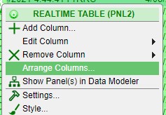
1. Click on the green button to bring up the panel configuration menu and select Arrange Columns
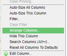
2. Click on a column to bring up the column menu and select Arrange Columns
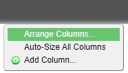
3. Click on an open area of the header in order to bring up the header menu. In the menu, select Add Column.
You can also click and drag a column to its desired position.
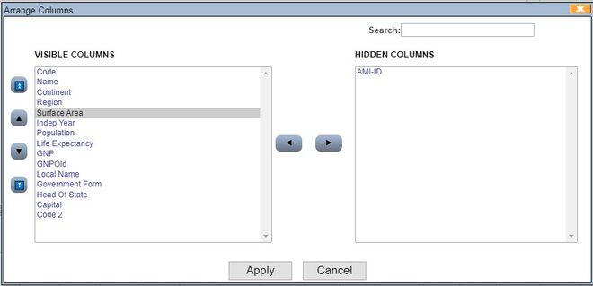
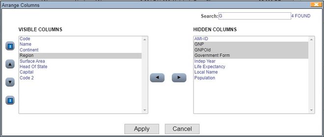
Arrange Columns Window
All of the columns of the table are listed in the Visible Columns section in the order they appear. You can use the control buttons on the left side of the box to move the selected column(s).
The Hidden Columns section will contain the columns you choose to hide from the table. Use the control buttons in the middle to switch a column from being visible to hidden.
The Search field at the top can be used to search for specific columns. As you type, matching columns will be highlighted and the number of columns found will be indicated to the right of the field.
When you are done rearranging, click on the Apply button.
Hiding a single column
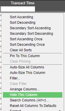
In addition to using arrange columns to hide columns, you can hide a column directly by clicking on a column's header and selecting Hide This Column. To make this column visible again, use the arrange column window.
Searching
When working on a table with many columns, you can use the Search Columns window to quickly jump to the column.
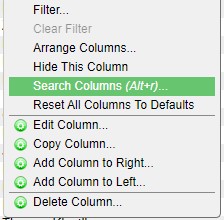
Click on any column and select Search Columns from the column menu. You can also use ALT + R hotkey to bring up the Search Columns window.
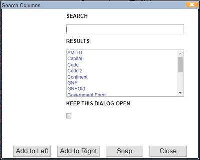
Search Columns Window
As you start typing in the Search field, the Results section will update with the matching columns. After selecting the column from the Results field, you can use the 3 buttons to either move the column to the left/right of the column you clicked on or snap/jump to the column.
Format
You can customize the formatting of table cells.
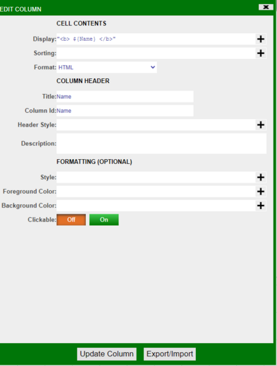
Custom HTML Formatting in Table Cells:
1) Click “Edit Column”
2) Under “Cell Contents” choose “HTML” from the format dropdown
3) In the “Display” field you can put in the HTML logic
a) Make sure it is in quotation marks
b) If you are referencing a variable do this ${varName}
4) For example, the picture below bolds the names
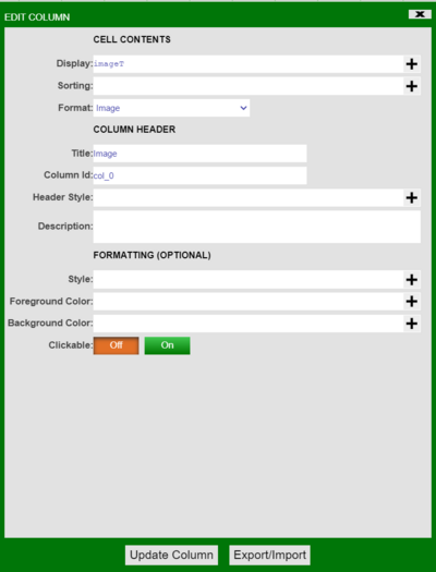
Custom Image Formatting in Table Cells:
There are three methods where you can upload an image.
Method 1: Uploading to Database
1) You can put the image in the database.
2) In the example below, imageT is the image
a) CREATE PUBLIC TABLE images(id Long,filename String,imageT Binary);
3) Click “Edit Column” on the column where you want to display the image
4) Under “Cell Contents” choose “Image” from the format dropdown
5) In “Display” put in the image variable
Method 2: Uploading to resource manager
1) It is best to create a custom method. Below is an example of a custom method
we created that you can use:
Binary uploadImg(String str) {
Binary bd = readBinaryFile("${str}");
String b64 = binaryToStr64Safe(bd);
return strToBinary("${b64}",64);
};
2) Go to Dashboard → Resource Manager
3) Right click and select “Upload File”
4) Right click on the image you want to upload in the resource manager and click “Get Relative HTTP URL”
5) Click “Edit Column” on the column you want to display the image.
6) In “Display” you call the custom method such as uploadImg(“relative HTTP URL”)
7) Choose “Image” from the dropdown “Format” menu
Method 3: Upload image through file upload
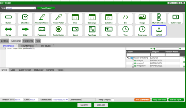
1) Create a HTML panel
2) Click on “Add Field/Button/Div”
3) Add “File Upload Field”
4) Create a custom method. For example, here we created a custom method called insertImage and called it in onChange()
boolean insertImage(FormPanel fp) {
FormUploadField ff = fp.getField("upload");
String filename = ff.getFileName();
Binary bd = ff.getFileBinaryData();
String b64 = binaryToStr64(bd);
use ds=AMI execute insert into images values("${filename}",
strToBinary("${b64}",64));
return true;
};
5) The image should now be uploaded in the database
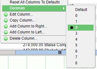
Number Columns
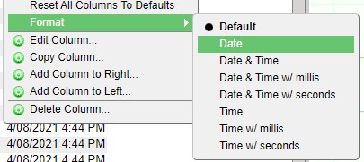
When working with number columns, you can quickly change the format of the column contents by using the Format option in the column menu. When available, hovering over the Format option will expand with a list of options available based on the content format.
Note: the underlying data is not changed.
Examples
Column where the cell content format is Numeric
Column where the cell content format is Date & Time
Column where the cell content format is Date & Time w/ nanos"
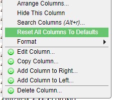
Reset all Columns to Defaults
To completely reset and revert any sorting, sizing, filtering, and arranging (note: hidden columns will become visible again), use the Reset All Columns to Defaults option from the column menu.
Relationships
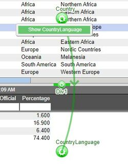
Relationships are used to establish links between the various panels in a layout. Establishing links between panels enables the drilling down of data from one table to another, the querying of static tables, and the rendering of displays in charts. When establishing a relationship, one panel will be considered the source panel and the other as the target panel.
Please refer to the Creating a Relationship Between Visualizations section of the GUI Getting Started for the steps in creating a relationship between two panels. This section will discuss the Behavior section of the relationship menu.
Run Relationship
| In real-time when user highlights rows causing query to change | Only runs the relationship if the rows selected will result in a change of the target table |
| In real-time when user highlights rows | Will run the relationship whenever a new row is selected |
| Only when user selects from right-click menu | Creates a right click menu in the source table. Use the right click menu to run the relationship. |
| Only when user double clicks on the row | Double click to run a relationship |
| Only on amiscript | Will only run when a script telling the relationship to run is executed |
Display Option
Bring target panel to front: when a relationship is run, the target panel will appear at the front of the dashboard. This will also work on minimized or hidden panels.
Leave target as is: the target panel will remain in place - minimized or hidden panels will stay minimized or hidden.
When Nothing Selected
| Do Nothing | Results from the latest query will remain in the target panel |
| Clear | The target panel will clear of all results |
| Show everything | The target panel will display all of the records that belong to the data set chosen for the target panel |
| Same as selecting everything | The target panel will display all of the records that correspond to the records currently shown in the source panel |
Conflate and Rerun
1. Overview
Conflate time and rerun time are two important parameters that dictate how often the data modeler is allowed to rerun. Conflate run time is the shortest time the data modeler is allowed to rerun, meaning that the data modeler cannot run more frequently than once per conflation time.
Conversely, auto rerun time is quite the opposite. It dictates the maximum time the data modeler is allowed to stay idle. We use the following example to demonstrate what these parameters mean and best practices to use them properly.
2. Example setup: Create a relationship between two Data models
2.1 Create a relationship between two visualization panels
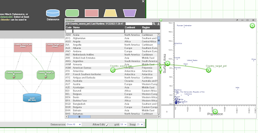
We start by creating 2 Data modelers based on the “City” table from the Mysql “world” data source. The Datamodel on the left is the source Datamodel and on the right is the target Datamodel.
Next, we create two panels: one source panel on the left, which is our selection panel, and the other panel on the right, which is the visualization panel showing the scatter plot on the rows we selected from the source panel. Then we can create a relationship on the target panel, linking to the source panel. Please refer to the previous section for more details on how to create a relationship between two visualization panels.
2.2 Setup Conflate Run time
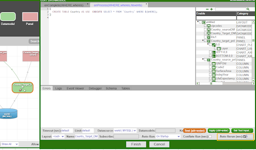
Click on the target data modeler. By default, neither Conflate Run time nor Auto Rerun time is enabled, which means every time you select a row on the source panel, the query will get fired and run the underlying data modeler. To avoid this, we can configure Conflate Run time, highlighted in the yellow box below.
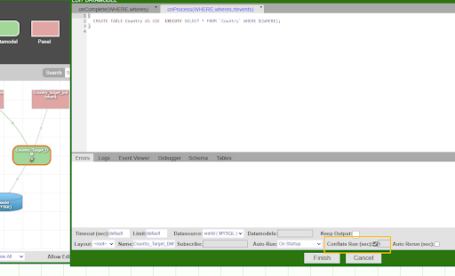
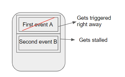
If we set Conflate Run time to be 5 seconds, this means if you have two real time events(say a query): event A and event B on the queue. Event A gets executed immediately, getting popped from the queue and triggers the Conflation mechanism. The next event, which is event B, will not get executed until 5 seconds later. In other words, as soon as the first event gets executed, the next event will get stalled by the conflation rerun time so that the data modeler does not rerun more frequently than 5 seconds per time.
First selection:
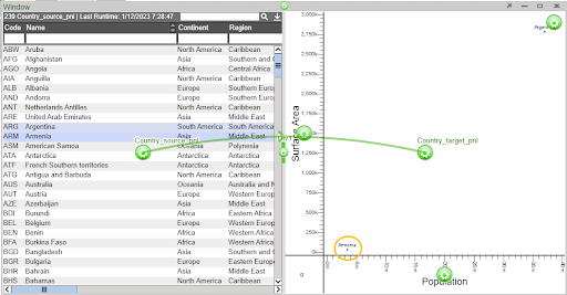
The user first selects only Argentina, this event gets triggered right away.
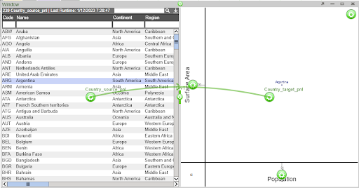
The next time the user makes a selection, the event gets stalled so that the target visualization panel does not update.
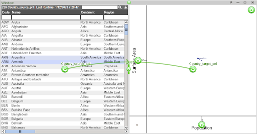
After 5 seconds, Event B gets fired and the target visualization panel gets updated.
2.2 Setup Auto Rerun time
Conversely, if you set Auto Rerun time to be 5 seconds, this means the query will get fired no less than once per 5 seconds. In other words, the data modeler cannot stay idle for more than 5 seconds.
