Difference between revisions of "Support FAQ"
| Line 1: | Line 1: | ||
= Helpful Tricks = | = Helpful Tricks = | ||
| − | = String Template (and Procedures) = | + | == String Template (and Procedures) == |
= Charts = | = Charts = | ||
Revision as of 08:49, 12 May 2022
Helpful Tricks
String Template (and Procedures)
Charts
Plotting Bar Chart Side-by-Side
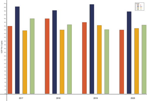
In this example, we will be plotting a grouped bar chart to show the GDP per capita for UK, USA, JPN and AUS between 2017 and 2020. The result looks as such:
To start off with, create a Datamodel with the code snippet below. Once we have a table with our data, in this case GDPPerCapita table we need to prepare the dataset to plot the data. The following code snippet prepares the data by creating a table called GDPPerCapitaPlot.
{
 create table GDPPerCapita (Year string, UK double, USA double, JPN double, AUS double);
 insert into GDPPerCapita values ("2017", 45000, 58000, 42000, 50000);
 insert into GDPPerCapita values ("2018", 50000, 55500, 42500, 46000);
 insert into GDPPerCapita values ("2019", 47500, 59500, 45500, 42700);
 insert into GDPPerCapita values ("2020", 42500, 54700, 43500, 45700);

 Table t = select * from GDPPerCapita;
 List yearList = select Year from GDPPerCapita;
 List valTypesList = t.getColumnNames();
 valTypesList.remove(t.getColumnLocation("Year"));

 create table GDPPerCapitaPlot (Year string, valType string, x double, val double);

 int n = 1;
 for (int i = 0; i < yearList.size(); i++) {
    Row r = t.getRow(i);
    string Year = r.get("Year");
    double ld = 0.0;
    int cnt = 0;
    for (string valType : valTypesList) {
      double val = r.get(valType);
      insert into GDPPerCapitaPlot values (Year, valType, n, val);
      ld += n;
      n += 1;
      cnt += 1;
    }
    ld = ld / cnt;
    insert into GDPPerCapitaPlot values (Year, "label", ld, 1.0);
    n+=1;
  }
}
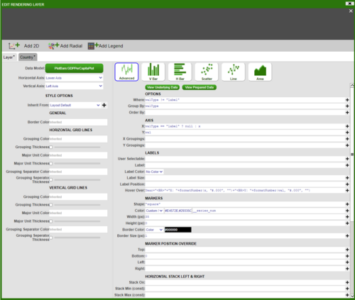
Next, we will add a visualisation to the Datamodel on the GDPPerCapitaPlot table. Choose the ‘2D Chart’ – ‘Advanced’, and fill in the options as below (For ‘Color’ in ‘MARKERS’ section choose Custom_Series and add series of colours in hex code for example ‘#E4572E,#29335C,#F3A712,#A8C686,#669BBC’):
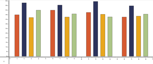
This will give us the following bar plot:
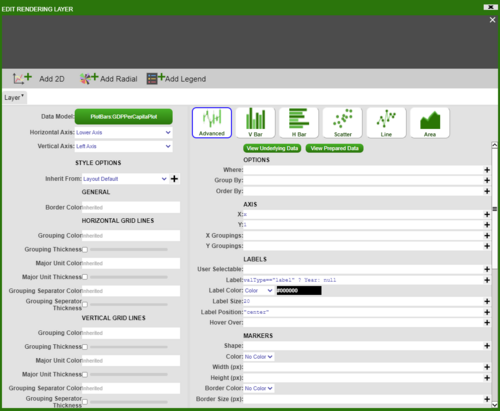
To add axis and get the final result, add a panel below the bar chart, then add a visualisation based on GDPPerCapitaPlot table with the following information:
Editing and styling the axis and the divider gives us the desired chart.
Plotting Multiple Line Graphs on Same Panel
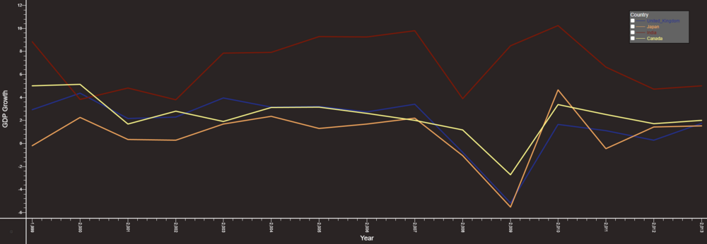
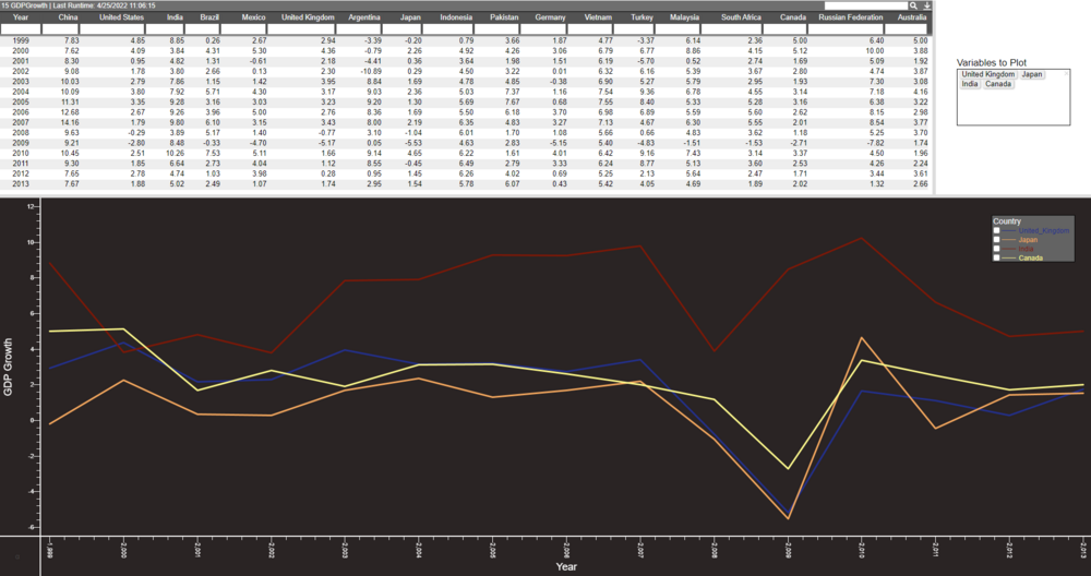
In this example we will show how to plot multiple line graphs on the same chart panel. We will use a sample dataset that shows the GDP Growth of several countries:
Output will look as such:
The method we will follow is similar to the one before. Firstly, we want to be able to choose the countries we plot, so we will create a HTML panel with a 'Multiple Checkbox' field called 'variables'. Once we have this field set up, insert the following snippet into a Datamodel.
{
  List vars = variables.getSelected();
  String varsStr = strJoin(",", vars);

  CREATE TABLE PlotSeries (Year long, yVals double, var string);
  for (string v : vars) {
    INSERT INTO PlotSeries (Year, yVals, var) FROM SELECT Year, ${v}, "${v}" FROM GDPGrowth;
  }
}
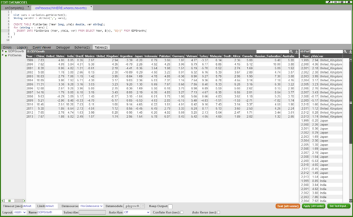
This creates a table PlotSeries which will be used to plot the graph:
Next create a visualisation on the Datamodel from above using the PlotSeries table and choose '2D Chart' - 'Advanced'. We will add 'Year' on the X-axis and 'yVals' on the Y-axis. We want to group the data by the Countries so add 'vars' in the 'Group By' option. Finally, we want to have the lines for each country represented by a different colour - in the 'Line Colour' option choose 'Series' (to get predetermined colours) or 'Custom Series' (to choose custom colours) and __series_num:
Inserting Data from Datamodel to AMI DB
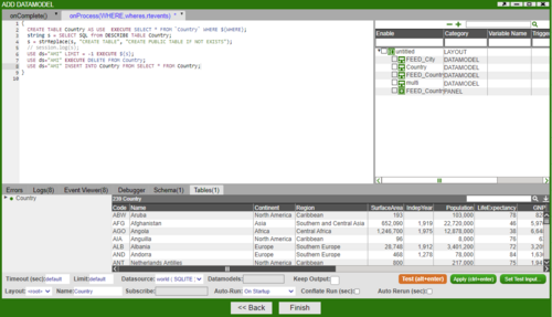
In this example, we will show how to insert data from one datasource to another by using the Datamodel. Here the Country table exists in a datasource called WORLD. We want to take this table and create a copy of it in AMI datasource. To create a copy of the Country table, we need the schema which we get using the DESCRIBE clause.
{
  CREATE TABLE Country AS USE  EXECUTE SELECT * FROM `Country` WHERE ${WHERE};
  string s = SELECT SQL from DESCRIBE TABLE Country;
  s = strReplace(s, "CREATE TABLE", "CREATE PUBLIC TABLE IF NOT EXISTS");
  // session.log(s);
  USE ds="AMI" LIMIT = -1 EXECUTE ${s};
  // USE ds="AMI" EXECUTE DELETE FROM Country;
  USE ds="AMI" INSERT INTO Country FROM SELECT * FROM Country;
}
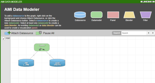
Firstly, create a Datamodel that is attached to the WORLD Datasource. Copy and paste the above script and run.
This will now give you the Country table in the AMI datasource.
Dynamic Aggregation on Visible Columns
In this example we go through the steps showing how a user can use visible columns to drive aggregate columns. This is done by getting the visible columns and using the column names to drive a new query whenever the columns are hidden or shown.
We start by creating a datamodel that produces a sample table with some data using the following code:
{
  CREATE TABLE Sample(`Id` int, `Country` string, `Sz` long, `Px` double, `Ordtype` string, `Side` string);
  INSERT INTO Sample Values(1,"HK",5000,3.00,"1","B");
  INSERT INTO Sample Values(2,"HK",3000,5.00,"2","B");
  INSERT INTO Sample Values(3,"CH",2000,6.00,"1","B");
  INSERT INTO Sample Values(4,"CH",1500,8.00,"2","S");
}
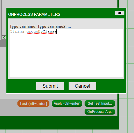
Create a blender on the previous datamodel. Add an argument into the ‘onProcessArgs’ this will be used to contain the column names that will drive the aggregation:
Use the following code to produce a new table that will have some aggregate columns, in this example we have a column that sums all of the sizes and a column that gives the average price.
We want to add some conditions using an if statement, this is where we make use of the ‘onProcessArg’ we defined previously. Since this argument will contain the column names that drive the aggregation we want to make sure that a table is still created even if the argument is empty. We do this by adding a condition to create a table from our existing columns if no new column is provided.
If we are given a new column name we add this to a select statement. We add the column name both in the select portion and then at the end to group the results of the query.
{
  if (groupByClause == "" || groupByClause == null) {
    //groupByClause = "Country, Ordtype, Side";
    create table CustomAggSample as select sum(Sz), avg(Px) from Sample;
  }
  else {
     create table CustomAggSample as select ${groupByClause}, sum(Sz), avg(Px) from Sample group by ${groupByClause};
  }
}
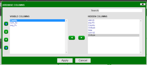
When columns are hidden or shown whichever column is furthest to the left drives the top level of aggregation and then each column to the right drives the next highest level and so on (not including the aggregate columns).
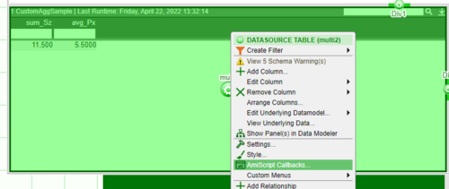
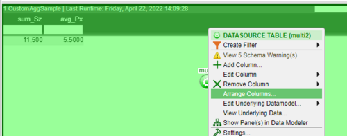
Open the custom callbacks from the following menu:
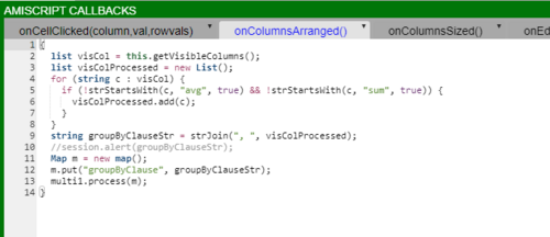
Within the ‘onColumnsArranged()’ paste the following code. This code first gets a list of all of the visible columns. Then we remove our aggregate columns, in this case we want to remove the sum of the size and average price columns, these are removed as they are not used in the aggregation but instead just show the results of the aggregation. We add each visible column name to a map m. We process our original datamodel and provide our map as the parameter, this map will be parsed to the ‘onProcessArg’ called ‘groupByClause’ that we defined earlier.
{
  list visCol = this.getVisibleColumns();
  list visColProcessed = new List();
  for (string c : visCol) {
    if (!strStartsWith(c, "avg", true) && !strStartsWith(c, "sum", true)) {
      visColProcessed.add(c);
    }
  }
  string groupByClauseStr = strJoin(", ", visColProcessed);
  //session.alert(groupByClauseStr);
  Map m = new map();
  m.put("groupByClause", groupByClauseStr);
  multi1.process(m);
}
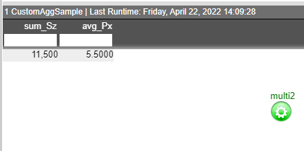
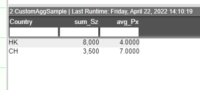
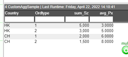
Finally hide or show columns as shown in the images below and watch the aggregation happen in real time.
We can see the results of hiding and showing the columns in the images below.
Autofill Text Fields Using a Lookup
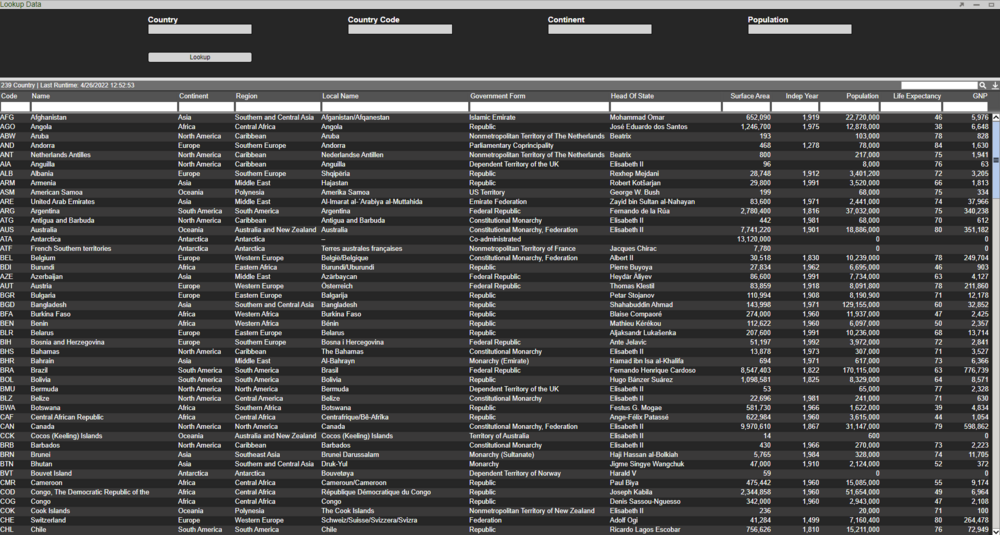
In this example we will show how to use the Country field to populate the Country Code, Continent and Population field. We will use the Country table for this example.
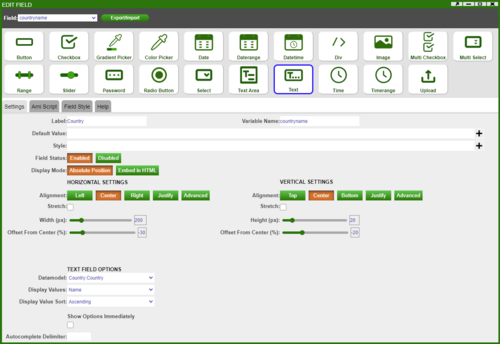
First create a HTML Panel and add a 'Text' field attached to the Country Datamodel and choose Name (here the Name column contains Country names) as the display value:
Use the same method to add the other fields of interest (ie. Country Code, Continent, Population). Next we will add a button called 'Lookup' with the following script - when this button is clicked the remaining fields will populate based on the chosen Country.
Table dbTable = layout.getDatamodel("Country").getData().get("Country");
string countryName = countryname.getValue();
Table dbTableInfo = dbTable.query("select Continent, Code, Population from this where Name==\"${countryName}\" limit 1");
string Continent = dbTableInfo.getRow(0).get("Continent");
string Code = dbTableInfo.getRow(0).get("Code");
string Population = dbTableInfo.getRow(0).get("Population");

if (strIs(Continent)) {
  continentname.setValue(Continent);
}
else {
  continentname.setValue("");
}

if (strIs(Code)) {
  countrycode.setValue(Code);
}
else {
  countrycode.setValue("");
}

if (strIs(Population)) {
  population.setValue(Population);
}
else {
  population.setValue("");
}
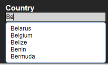
This scripts uses a function called query to get the values corresponding to the chosen Country. When searching for a Country we also get a dropdown list of the Countries:
Performing a lookup on Belgium, we can see the other fields are populated:
Filtering in Select Fields
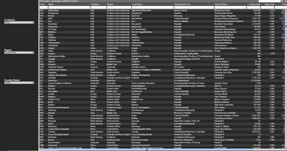
In this example we will use the Country table and create 3 select fields. The output of the first select field will be used in the WHERE clause to give the filtered selection of data which acts as the input of the second select field.
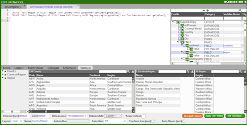
First we will create 3 select fields and call them Continent, Region and Country Name. Then create a blender on the Country datamodel called CountryFiltered and insert the following snippet:
{
  CREATE TABLE Region AS SELECT Region FROM Country WHERE Continent==continent.getValue();
  CREATE TABLE CountryInRegion AS SELECT Name FROM Country WHERE Region==region.getValue() and Continent==continent.getValue();
}
Here the continent.getValue() and region.getValue() gets the value in the select field named Continent and Region respectively.
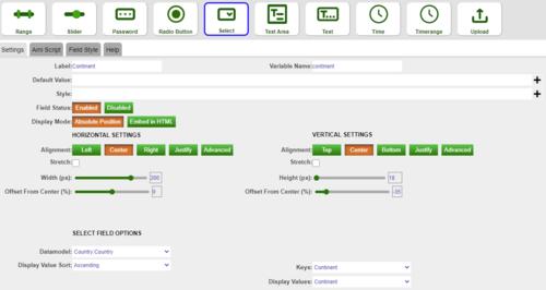
Next we will set up the three fields as shown below. We get the relevant data from the CountryFiltered datamodel.
Finally, in order for the select field options to update each time we select a different Continent or Region, we will need to reprocess the datamodel. Thus for the Continent and Region select field, add the following AMI Script:
layout.getDatamodel("CountryFiltered").reprocess();
