Difference between revisions of "GUI"
| Line 1: | Line 1: | ||
=Getting Started= | =Getting Started= | ||
| − | ==Logging In & The Dashboard | + | ==Logging In & The Dashboard== |
Log into AMI with the provided user name and password (default user/password is ''demo/demo123'') | Log into AMI with the provided user name and password (default user/password is ''demo/demo123'') | ||
Revision as of 21:04, 14 April 2021
Getting Started
Logging In & The Dashboard
Log into AMI with the provided user name and password (default user/password is demo/demo123)
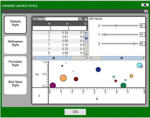
After logging into AMI, choose a layout style (Default Style is shown)
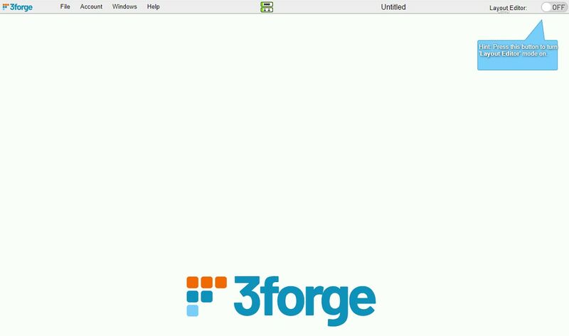
After selecting a style, you will move onto the new dashboard
On the dashboard you will see 1) a Layout Editor toggle button in the upper right corner, 2) a menu bar at the top, and 3) the workbook area below where you add layout components
1. Layout Editor Toggle Button
(Hotkey: CTRL + D)
AMI dashboard builder has two modes. When the Layout Editor is turned on, you have access to tools and functionality for editing the dashboard.
Note: if you do not see the Layout Editor Button, your user account is not entitled for building layouts.
- The Windows menu will have an option to add New Windows and to Manage Windows
- There will be a new Dashboard menu item for accessing tools
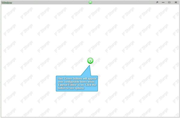
- All existing panels will have a green button for accessing that panel's settings
2. The Menu
- File: manage saving and loading of dashboards
- Account: control your personal settings and preferences
- Windows: access, manage, and create windows
- Help: get AMI version, Runtime settings, and list of available script methods, etc.
- Dashboard (in Layout Editor mode): access tools and functionality for building out the dashboard
(Clicking on the 3Forge icon will open up 3Forge's website in a new tab)
3. The Workbook
This is where the dashboard is presented as it is built or loaded
Creating Your First Visualization
Creating a visualization can be summarized into 3 steps:
1. Create a window to put your visualization in 2. Connect to the data using the Data Modeler 3. Select how you want to visualize your data
Let's demonstrate this by creating a table. Before proceeding,
1. After logging into AMI, enter Layout Editor mode by toggling the Layout Editor mode to ON (found on the upper right corner).
(Hotkey: CTRL + D)
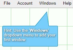
2. The dashboard will now have a grid over the work area and a prompt telling you to click on the Windows menu will appear.
3. Select New Window from the drop down options in order to create a new window with a blank panel
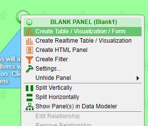
4. Click on the green button in order to access the panel's options and select Create Table/Visualization Form
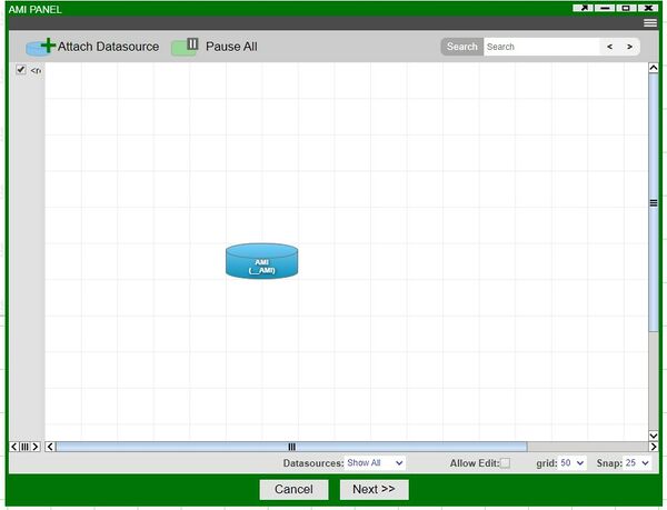
5. This will open up the visualization wizard. The first step of the wizard is the Data Modeler, which is the primary way of connecting to the data you want to visualize.
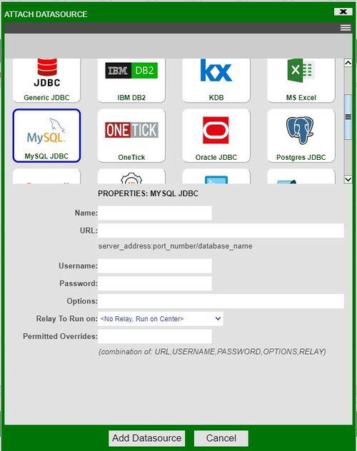
6. At the top of the Data Modeler, click on Attach Datasource in order to connect to a database containing your data. This will open up the Add Datasource window. In our example, we will be connecting to a MySQL database. Fill out the necessary fields and click on the Add Datasource button
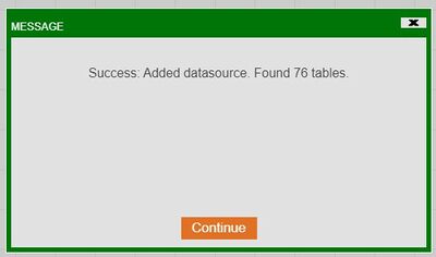
7. A successful connection will show a similar prompt.
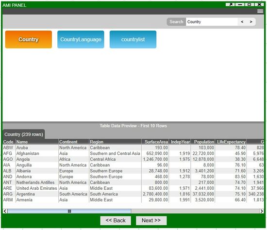
8. Next, you will see all of the tables that are accessible in the datasource. Select the table you would like to visualize. You can use the search function in datasources containing many tables.
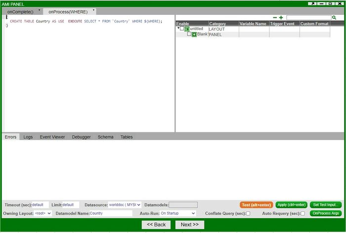
9. You will then be taken to the editing portion of the Data Modeler. Here, you can 'massage' the data in preparation for use in the visualization. If you are ready, click on Test. If everything is working and there are no errors, click on Next.
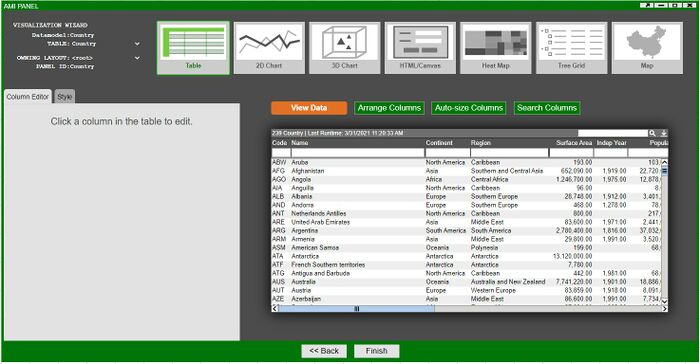
10. In the final portion of the visualization wizard, you will select the kind of visualization you would like to create in the panel. In our example, we will create a table by selecting the Table icon and clicking on Finish.
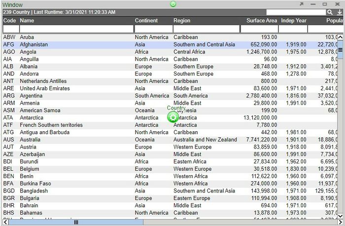
11. In place of a blank panel, we now have our table
In summary - using the visualization wizard, we first created a Datamodel based on a table found in the datasource. We then edited the Datamodel in the Datamodel editor before finally using it to create a table. Many of the topics in this tutorial will be covered in greater detail throughout the GUI documentation.
Creating a Relationship Between Visualizations
Continuing from the previous section, we will build a second visualization and establish a relationship between two panels (two visualizations).
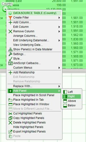
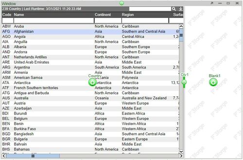
1. Click on the panel configuration button of the created table and select Add Panel > Right in order to create a empty panel to the right side of the table.
Note: use the divider in order to adjust the size of the panels. You can also adjust the size of the window
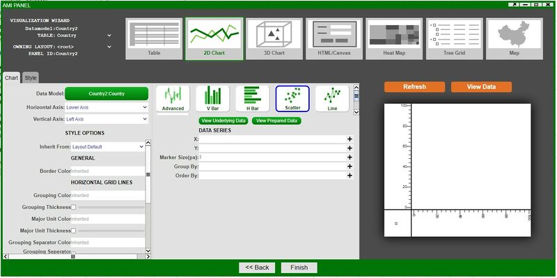
2. Click on the new panel's configuration button and follow the steps of the previous section up to the final step of the visualization wizard. This time, we will select 2D Chart in the wizard
3. Selecting 2D Chart opens up another set of options - select Scatter Plot and then click on Create Chart in order to open the chart wizard
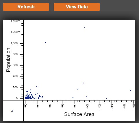
4. Under DATA SERIES, click on the ![]() of the X & Y fields in order to see the variables that can be used. After selecting the desired variables, click on Refresh in order to preview the chart.
of the X & Y fields in order to see the variables that can be used. After selecting the desired variables, click on Refresh in order to preview the chart.
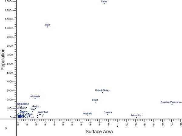
Note: Scatter is one of the ready-made chart options - with many of the fields pre-populated and only requiring X & Y values. Advanced contains all of the options that can be configured on a chart. Adding Labels can be done in the Advanced section.
5. Click Finish in order to return to the dashboard and to view the chart.
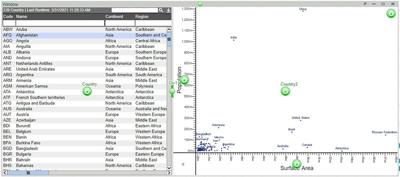
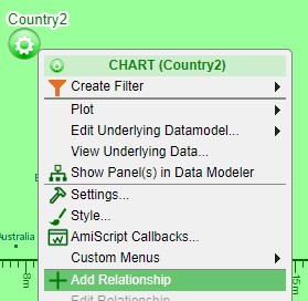
6. AMI allows you to easily correlate the two visualizations by creating a relationship between the two panels - a source and a target. In order to create a relationship, click on the configuration button of the target panel (Country2/chart) and select Add Relationship.
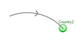
7. An arrow will appear from the configuration button. Move to the source panel (Country/table) and click on the configuration button in order to establish the relationship.
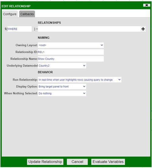
8. Once established, a relationship menu will appear. Use this menu to select the variables that the relationship will use to correlate between the two visualizations. A variable that is available on both visualizations must be used in order to correctly maintain the relationship. In our example, we will use the Code variable found in both tables.
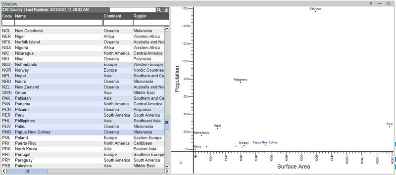
9. With a relationship between the two visualizations, selecting rows from the table will now display correlated points on the scatter plot.
In summary - we established a second panel in a single window and created a chart on this new panel. We then created a relationship between the table and the chart in order to show a correlation between the two visualizations.
