Difference between revisions of "GUI Charts"
(→Axes) |
|||
| (52 intermediate revisions by 7 users not shown) | |||
| Line 26: | Line 26: | ||
''A basic chart'' | ''A basic chart'' | ||
| − | + | =Chart Basics= | |
| − | + | ==Plots== | |
One or more plots can be added to a chart, forming a grid of plots. Each plot can contain any number of layers, stacked from front to back such that the front layer will obscure data from layers behind it, depending on the transparency of each layer. Once a chart has been created, additional plots can always be added to existing plots. There are two ways to add (or remove) plots. | One or more plots can be added to a chart, forming a grid of plots. Each plot can contain any number of layers, stacked from front to back such that the front layer will obscure data from layers behind it, depending on the transparency of each layer. Once a chart has been created, additional plots can always be added to existing plots. There are two ways to add (or remove) plots. | ||
| Line 51: | Line 51: | ||
[[File:GUI.Charts.9.jpg|700px]] | [[File:GUI.Charts.9.jpg|700px]] | ||
| − | + | '''Additional points''' | |
| − | When removing plots of 2x2 or larger, the options to remove plots will either be removing a row or plots or column of plots. | + | *The size of each plot can be modified by adjusting the lines dividing the plots. |
| + | |||
| + | *When removing plots of 2x2 or larger, the options to remove plots will either be removing a row or plots or column of plots. | ||
[[File:GUI.Charts.10.jpg|700px]] | [[File:GUI.Charts.10.jpg|700px]] | ||
| − | + | ==Axes== | |
Any number of horizontal axes can be added to the top or bottom of a column of plots and any number of vertical axes can be added to the left or right of a row of plots. There are two ways to add additional axes to a chart. | Any number of horizontal axes can be added to the top or bottom of a column of plots and any number of vertical axes can be added to the left or right of a row of plots. There are two ways to add additional axes to a chart. | ||
| − | 1. | + | 1. As seen in the addition of plots, use the plot configuration button menu and select one of the options under '''Add''' (add to the left, right, above, or below). |
| + | |||
| + | 2. Add axes directly to existing axes using the axis configuration button. | ||
| + | |||
| + | <span style="color: blue;">'''Examples'''</span> - adding an axis above using the plot configuration button vs. adding an axis above an existing axis | ||
| + | |||
| + | [[File:GUI.Charts.11.jpg|700px]] | ||
| + | |||
| + | ''Adding an axis above using the plot configuration button will add an axis above the plot'' | ||
| + | |||
| + | [[File:GUI.Charts.12.jpg|700px]] | ||
| + | |||
| + | ''Adding an axis above using the axis configuration button (blue circle) added an axis directly above it (orange highlight) | ||
| + | |||
| + | '''Additional points''' | ||
| + | |||
| + | *When there are multiple plots used in a chart, new axes are added to the outside edges of the chart. For example, choosing to add an axis above on any of the plots in a column will add an axis to the very top of the chart. Choosing to add an axis to the right of any of the plots in a row will add an axis to the right edge of the chart. | ||
| + | |||
| + | ===Editing the Axis=== | ||
| + | In order to add or modify a '''title''' of an axis, click on the axis configuration button and select '''Edit Highlighted Axis'''. In the Edit Axis window, you will be able to add a title using the '''Title''' field. | ||
| + | |||
| + | [[File:GUI.Charts.13.jpg]] | ||
| + | |||
| + | [[File:GUI.Charts.14.jpg|400px]] | ||
| + | |||
| + | In this same Edit Axis window, you may also modify the '''format type''' of the axis. By default, the '''Auto''' setting is used when charts are made. However, you may select another format from the drop down (e.g., Numeric). Selecting a different format will enable the editing of the other fields in the window. | ||
| + | |||
| + | [[File:GUI.Charts.15.jpg|400px]] | ||
| + | |||
| + | ==Layers== | ||
| + | |||
| + | In order to render (display) the data model in the chart, a rendering layer must be added to the plot. Rendering layers (layers for short) allow the display of multiple charts on a single plot using the same or multiple data sets: | ||
| + | |||
| + | *If the data sets are to use the same axes, use a '''single''' layer with '''multiple''' series | ||
| + | |||
| + | *If the data sets are to use '''different''' axes, use '''multiple''' layers | ||
| + | |||
| + | *If two or more data models are used, you '''must''' use '''multiple''' layers | ||
| + | |||
| + | ===Adding a new layer manually=== | ||
| + | When you use the visualization wizard to create a new chart on a blank panel, layers will be automatically added. However, if you are working on a blank chart or you would like to add more layers to an existing chart, use the '''Edit Plot''' option found in the plot configuration menu. This will bring up the '''Edit Rendering Layer''' window. | ||
| + | |||
| + | [[File:GUI.Charts.17.jpg]] | ||
| + | |||
| + | [[File:GUI.Charts.18.jpg|500px]] | ||
| + | |||
| + | In the '''Edit Rendering Layer''' window, click on the '''Add 2D''' button to add a a new 2D chart layer. | ||
| + | |||
| + | [[File:GUI.Charts.19.jpg|750px]] | ||
| + | |||
| + | *The Layer tab is divided with the '''Style Options''' on the left and the '''Chart Options''' on the right. | ||
| + | *In addition to the style options, the upper left contains the options to choose a datamodel for the layer and the ability to choose a horizontal/vertical axis (when working with multiple axes). | ||
| + | *Clicking on the datamodel button will open up the data modeler. When adding layers manually, it is better to have the datamodels prepared in advance. | ||
| + | *In the Chart Options side on the right, you have the different chart option tiles. These are the same tiles you will find in the visualization wizard when building charts. Switching between the tiles changes the relevant fields below (e.g., switching between the Scatter and Line tiles, you will notice that a '''Line Size(px)''' field is required. | ||
| + | *Use the '''Advanced''' tile in order to have the most control over the chart you would like to create. This tile will make all of the 2D chart fields available. | ||
| + | *After filling in the required fields, click Apply to create the layer | ||
| + | |||
| + | <span style="color: blue;">'''View Underlying Data'''</span> and <span style="color: blue;">'''View Prepared Data'''</span> | ||
| + | |||
| + | The '''View Underlying Data''' and '''View Prepared Data''' buttons found under the chart tiles can be used to quickly view the data that is to be used. The view underlying data will show the raw data from the datamodel, whereas the view prepared data will show the data after the fields are taken into account. | ||
| + | |||
| + | For example, I will make the Marker Size depend on the formula of (High > 11 ? 3 : 1). In the prepared data window, you can see that the marker sizes are 1 whenever the value of High (the Y axis) is less than 11. | ||
| + | |||
| + | [[File:GUI.Charts.20.jpg]] | ||
| + | |||
| + | ==Styles== | ||
| + | ===Colors=== | ||
| + | In 2D/3D chart, after you have selected a visualization type, in the dropdown menu for Colors, you will encounter the following options: | ||
| + | |||
| + | No Color: self-explanatory. | ||
| + | |||
| + | Color: choose any color, by sampling or inputting the hex code in the color picker helper. | ||
| + | |||
| + | Formula: input a function that returns a color. | ||
| + | ex: Population > 4000000? "#955e42":"#5603ad" | ||
| + | |||
| + | Series: input a function that returns a number. AMI will index it through the default collection of color and determine the color. The default color collection can be changed under Dashboard -> Style Manager -> Root -> Panel -> Chart -> Partition Colors, the list must contain valid hex codes and is comma delimited. | ||
| + | ex: SurfaceArea+100 | ||
| + | |||
| + | Gradient: input a variable that is numeric and AMI will vary the color intensity of the markers depending on the value with the default color spectrum. The color spectrum can be changed in Style Manager under Dashboard -> Style Manager -> Root -> Panel -> Chart -> Gradient Colors. | ||
| + | ex: Population | ||
| + | |||
| + | Custom Series: same as Series except user must input a comma delimited list of hex codes in the second field, and input a function that returns a number in the third field. User may hardcode the number and that would mean only one color will be picked. | ||
| + | ex: | ||
| + | Field 2:#d78521,#ffa65c,#871303,#fff98a,#c40505,#80e8a6,#8e0073,#7df8ff,#068947,#c49fff | ||
| + | Field 3:SurfaceArea | ||
| + | |||
| + | Custom Gradient: user-define color spectrum, otherwise same as Gradient. | ||
| + | |||
| + | =3D Charts on AMI= | ||
| + | |||
| + | This document explains the usage of each field in a 3D chart. The fields are categorized into 3 sections: formulas, axis, styles. The order of the explanation in this document is based on the diagram below. | ||
| + | |||
| + | |||
| + | [[File:3DCharts_(11).png|width|600px]] | ||
| + | <br> | ||
| + | |||
| + | Below is all styles: | ||
| + | <br> | ||
| + | |||
| + | [[File:3DCharts_(13).png|width|600px]] | ||
| + | |||
| + | [[File:3DCharts_(12).png|width|600px]] | ||
| + | |||
| + | [[File:3DCharts_(15).png|width|800px]] | ||
| + | <br> | ||
| + | |||
| + | ==Formulas== | ||
| + | |||
| + | 1. View Underlying data | ||
| + | |||
| + | <br> | ||
| + | Shows the data where the visualization is going to be based on. Example view below. | ||
| + | <br> | ||
| + | |||
| + | |||
| + | [[File:3DCharts_(14).png|width|800px]] | ||
| + | <br> | ||
| + | |||
| + | 2. View Prepared data | ||
| + | <br> | ||
| + | |||
| + | Shows the underlying data as well as properties of the marker. Properties include: | ||
| + | <ul><li>Marker Shape | ||
| + | |||
| + | <li>Marker Color | ||
| + | |||
| + | <li>Marker Width | ||
| + | |||
| + | <li>Marker Height | ||
| + | |||
| + | <li>Marker Depth | ||
| + | |||
| + | <li>Axis (coordinates) X/Y/Z | ||
| + | </li></ul> | ||
| + | |||
| + | Example view below. | ||
| + | |||
| + | [[File:3DCharts_(17).png|width|800px]] | ||
| + | |||
| + | 3. Data model | ||
| + | <br> | ||
| + | |||
| + | Shows the name of the datamodel of which the visualization is based on. | ||
| + | |||
| + | |||
| + | 4. Type | ||
| + | <br> | ||
| + | |||
| + | Indicates whether the graph is a surface plot or a scatter plot. | ||
| + | |||
| + | ===Options=== | ||
| + | [[File:3DCharts_(16).png|width|600px]] | ||
| + | |||
| + | 5. Where | ||
| + | <br> | ||
| + | |||
| + | Filters the data based on user-defined, semicolon delimited conditions. The graph would only show points which satisfies the boolean argument (e.g. suppose x-axis is “Quantity”. Inputting Quantity > 0 would cause the graph to only show points where Quantity > 0). | ||
| + | |||
| + | |||
| + | 6. Group By | ||
| + | <br> | ||
| + | |||
| + | Affects the grouping in “View Prepared Data”. | ||
| + | |||
| + | |||
| + | 7. Order By | ||
| + | <br> | ||
| + | |||
| + | Affects the ordering in “View Prepared Data”. | ||
| + | ==Axis== | ||
| + | [[File:3DCharts_(21).png]] | ||
| + | |||
| + | X/Y/Z Axis: required. Indicates what the coordinate values come from. Each axis takes a column’s name as input. Column data must be numeric. | ||
| + | |||
| + | [[File:3DCharts_(19).png]] | ||
| + | |||
| + | ==Formulas== | ||
| + | |||
| + | ===Labels=== | ||
| + | [[File:3DCharts_(25).png]] | ||
| + | |||
| + | 8. User Selectable | ||
| + | <br> | ||
| + | |||
| + | 9. Description | ||
| + | <br> | ||
| + | |||
| + | Indicates what to annotate next to each data point on the chart. | ||
| + | <br> | ||
| + | |||
| + | |||
| + | 10. Hover over | ||
| + | <br> | ||
| + | |||
| + | Indicates what to show when hovering over a data point. | ||
| + | ===Markers=== | ||
| + | [[File:3DCharts_(22).png]] | ||
| + | |||
| + | 11. Shape | ||
| + | <br> | ||
| + | |||
| + | Indicates the shape of each data point on the chart. | ||
| + | <br> | ||
| + | |||
| + | |||
| + | 12. Color | ||
| + | <br> | ||
| + | |||
| + | Determines the color of each data point. | ||
| + | <br> | ||
| + | |||
| + | |||
| + | 13. Width/Height/Depth (px) | ||
| + | <br> | ||
| + | |||
| + | Determines the size of the data points, in pixel, on the chart. | ||
| + | ===Marker Position Override=== | ||
| + | [[File:3DCharts_(24).png]] | ||
| + | |||
| + | 14. Top/Bottom/Left/Right/Front/Back | ||
| + | <br> | ||
| + | |||
| + | Forces each marker stretch to the specific value, relative to the range of X/Y/Z. Ex: if one of your markers has position (1x,2y,3z) and your graph has minimum Y value of -5 and maximum y value of 5, and you set Top as 5, then that marker will now stretch to (1x,5y,3z). The previous marker position is not erased so a line is formed, spanning from 2y to 5y. Setting a value outside of the current range will cause the marker line to go outside of the chart. Setting a negative value for Top is equivalent to setting a positive value for Bottom, vice versa. The same rule applies to Left/Right, Front/Back. | ||
| + | ===Lines=== | ||
| + | [[File:3DCharts_(26).png]] | ||
| + | |||
| + | 15. Line Color | ||
| + | <br> | ||
| + | |||
| + | Indicates the line color. | ||
| + | <br> | ||
| + | |||
| + | 16. Line Size (px) | ||
| + | <br> | ||
| + | |||
| + | Indicates the line size, in pixel, connecting the data points. | ||
| + | ==Styles== | ||
| + | [[File:3DCharts_(27).png|width|800px]] | ||
| + | [[File:3DCharts_(28).png|width|800px]] | ||
| + | [[File:3DCharts_(29).png|width|800px]] | ||
| + | [[File:3DCharts_(30).png|width|800px]] | ||
| + | |||
| + | 1. Inherit From | ||
| + | <br> | ||
| + | |||
| + | Can be changed in Style Manager under Dashboard. This applies the selected styles from the Style Manager. | ||
| + | ===General=== | ||
| + | [[File:3DCharts_(31).png|width|600px]] | ||
| + | |||
| + | |||
| + | 2. Background Color | ||
| + | <br> | ||
| + | |||
| + | Applies to the background of the visualization. | ||
| + | <br> | ||
| + | |||
| + | |||
| + | 3. Selection Color | ||
| + | <br> | ||
| + | |||
| + | Affects the color you see when you select a data point on the chart. | ||
| + | <br> | ||
| + | |||
| + | |||
| + | 4. Label Color | ||
| + | <br> | ||
| + | |||
| + | Affects the color of the labels on the bottom of the visualization. In the screenshot below I have changed the color of the labels to red. | ||
| + | |||
| + | [[File:3DCharts_(32).png|width|800px]] | ||
| + | |||
| + | 5. Control Buttons Color | ||
| + | <br> | ||
| + | |||
| + | Affects the color of the buttons on the bottom left of the visualization as seen below. | ||
| + | |||
| + | [[File:3DCharts_(33).png|width|800px]]<h2>Scroll Bar Colors</h2> | ||
| + | [[File:3DCharts_(1).png|width|800px]] | ||
| + | |||
| + | The colors here all refer to the scroll bars on the bottom of visualization, labeled “X”, “Y”, “Z”, “Zoom”, “FOV” and such. | ||
| + | |||
| + | [[File:3DCharts_(2).png|width|800px]]<h2>Scroll Bar Options</h2> | ||
| + | [[File:3DCharts_(3).png|width|800px]] | ||
| + | |||
| + | The options here all refer to the <em>single</em> scroll bar at the bottom of the visualization. | ||
| + | |||
| + | [[File:3DCharts_(4).png|width|600px]]<h2>Visualization Title</h2> | ||
| + | [[File:3DCharts_(5).png|width|600px]] | ||
| + | |||
| + | The options here control the title of the visualization. By default there is no title displayed on the chart. Below is an example usage | ||
| + | |||
| + | [[File:3DCharts_(6).png|width|600px]] | ||
| + | [[File:3DCharts_(7).png|width|600px]]<h2>Visualization Padding</h2> | ||
| + | [[File:3DCharts_(8).png|width|600px]] | ||
| + | |||
| + | The options here control the padding of the visualization as a whole, the padding will cover the chart if set as a high value. Example usage below: | ||
| + | |||
| + | [[File:3DCharts_(9).png|width|600px]] | ||
| + | [[File:3DCharts_(10).png|width|600px]]<h2>Visualization Border</h2> | ||
| + | [[File:3DCharts_(18).png|width|600px]] | ||
| + | |||
| + | The bigger the size, the less space there is for the visualization, the bigger the borders. Color controls the border color. Example usage below | ||
| + | |||
| + | [[File:3DCharts_(20).png]] | ||
| + | <br> | ||
| + | [[File:3DCharts_(23).png|width|600px]] | ||
| + | |||
| + | ==3D Charts PDF== | ||
| + | [[File:3D Charts on AMI.pdf]] | ||
| + | |||
| + | =Examples= | ||
| + | ==Candlestick Chart== | ||
| + | |||
| + | [[File:CandlestickChartImage.png]] | ||
| + | |||
| + | A candlestick chart can be built using AMI through the following steps. | ||
| + | |||
| + | 1. Create an empty 2D chart visualization on top of your datamodel, in this example, we are using the following Sample datamodel: | ||
| + | |||
| + | [[File:CandlestickChartDM.png]] | ||
| + | |||
| + | 2. Using the advanced option, we will create the candle layer first with the following parameters: | ||
| + | |||
| + | {| class="wikitable" | ||
| + | |- | ||
| + | | 1 || '''AXIS X''' || date | ||
| + | |- | ||
| + | | 2 || '''MARKERS Shape''' || “square” | ||
| + | |- | ||
| + | | 3 || '''MARKERS Color - Formula''' || (close > open ) ? “#00FF00” : “#FF0000” ''(Optional - to differentiate bars)'' | ||
| + | |- | ||
| + | | 4 || '''MARKER POSITION OVERRIDE Top''' || open | ||
| + | |- | ||
| + | | 5 || '''MARKER POSITION OVERRIDE Bottom''' || close | ||
| + | |- | ||
| + | | 6 || '''MARKER POSITION OVERRIDE Left''' || date - 35000000 | ||
| + | |- | ||
| + | | 7 || '''MARKER POSITION OVERRIDE Right''' || date + 35000000 | ||
| + | |} | ||
| + | |||
| + | [[File:CandlestickChartStick.png]] | ||
| + | |||
| + | [[File:CandlestickChartCandleImage.png]] | ||
| + | |||
| + | 3. Add a new layer on top of the chart (stick layer): | ||
| + | |||
| + | [[File:CandlestickChartLayers.png]] | ||
| + | |||
| + | 4. Using the advanced option as well, create the stick layer with the following parameters: | ||
| + | |||
| + | {| class="wikitable" | ||
| + | |- | ||
| + | | 1 || '''AXIS X''' || date | ||
| + | |- | ||
| + | | 2 || '''MARKERS Shape''' || “square” | ||
| + | |- | ||
| + | | 3 || '''MARKERS Color - Color''' || #000000 | ||
| + | |- | ||
| + | | 4 || '''MARKERS - Width''' || 1 | ||
| + | |- | ||
| + | | 5 || '''MARKERS - Height''' || 1 | ||
| + | |- | ||
| + | | 6 || '''MARKER POSITION OVERRIDE Top''' || high | ||
| + | |- | ||
| + | | 7 || '''MARKER POSITION OVERRIDE Bottom''' || low | ||
| + | |} | ||
| + | |||
| + | [[File:CandlestickChartCandle.png]] | ||
| + | |||
| + | |||
| + | ==OHLC Chart== | ||
| + | |||
| + | [[File:Ohlcchart.png|(small)px]] | ||
| + | |||
| + | |||
| + | OHLC (open-high-low-close) chart consists of: | ||
| + | * a vertical line that represents the intraday range for the period | ||
| + | * a horizontal line extending to the left that represents the opening price for the period | ||
| + | * a horizontal line extending to the right that represents the closing price for the period | ||
| + | |||
| + | |||
| + | It can be built using AMI through the following steps: | ||
| + | |||
| + | 1. Create an empty 2D chart visualization on top of your datamodel, in this example, we are using the following Sample datamodel: | ||
| + | |||
| + | [[File:Ohlc chart table.png|(small)px]] | ||
| + | |||
| + | |||
| + | 2. Using the advanced chart option, we will create the intraday range (vertical line) layer first with the following parameters: | ||
| + | {| class="wikitable" | ||
| + | |- | ||
| + | | 1 || '''AXIS X''' || date (or use the parseDate() formula if the date field is a string ) | ||
| + | |- | ||
| + | | 2 || '''MARKERS Shape''' || “square” | ||
| + | |- | ||
| + | | 3 || '''MARKERS Color - Formula''' || (close > open ) ?"#ff0000":"#32cd32" | ||
| + | |- | ||
| + | | 4 || '''MARKERS - Width''' || 1 | ||
| + | |- | ||
| + | | 5 || '''MARKERS - Height''' || 1 | ||
| + | |- | ||
| + | | 6 || '''MARKER POSITION OVERRIDE Top''' || high | ||
| + | |- | ||
| + | | 7 || '''MARKER POSITION OVERRIDE Bottom''' || low | ||
| + | |} | ||
| + | |||
| + | |||
| + | [[File:Ohlc intradayrange config ss.png]] | ||
| + | |||
| + | |||
| + | 3. Click on 'Add 2D' and add a new layer on top of the chart. (Opening Price - Horizontal Left Line layer) | ||
| + | |||
| + | [[File:Ohlc openingprice layer.png]] | ||
| + | |||
| + | |||
| + | 4. Using the advanced option as well, create the Opening Price layer with the following parameters: | ||
| + | |||
| + | {| class="wikitable" | ||
| + | |- | ||
| + | | 1 || '''AXIS X''' || date (or use the parseDate() formula if the date field is a string ) | ||
| + | |- | ||
| + | | 2 || '''MARKERS Shape''' || “square” | ||
| + | |- | ||
| + | | 3 || '''MARKERS Color - Formula''' || (close > open ) ?"#ff0000":"#32cd32" | ||
| + | |- | ||
| + | | 4 || '''MARKER POSITION OVERRIDE Top''' || open | ||
| + | |- | ||
| + | | 5 || '''MARKER POSITION OVERRIDE Bottom''' || open + 0.01 | ||
| + | |- | ||
| + | | 6 || '''MARKER POSITION OVERRIDE Left''' || date - 35000000 | ||
| + | |- | ||
| + | | 7 || '''MARKER POSITION OVERRIDE Right''' || date + 100000 | ||
| + | |} | ||
| + | |||
| + | |||
| + | [[File:Ohlc opening price layer config final.png]] | ||
| + | |||
| + | 4. Click on 'Add 2D' and add the 3rd layer (Closing Price - Horizontal Right Line layer). Using the advanced option as well, create the Closing Price layer with the following parameters: | ||
| + | |||
| + | {| class="wikitable" | ||
| + | |- | ||
| + | | 1 || '''AXIS X''' || date (or use the parseDate() formula if the date field is a string ) | ||
| + | |- | ||
| + | | 2 || '''MARKERS Shape''' || “square” | ||
| + | |- | ||
| + | | 3 || '''MARKERS Color - Formula''' || (close > open ) ?"#ff0000":"#32cd32" | ||
| + | |- | ||
| + | | 4 || '''MARKER POSITION OVERRIDE Top''' || close | ||
| + | |- | ||
| + | | 5 || '''MARKER POSITION OVERRIDE Bottom''' || close + 0.01 | ||
| + | |- | ||
| + | | 6 || '''MARKER POSITION OVERRIDE Left''' || date - 100000 | ||
| + | |- | ||
| + | | 7 || '''MARKER POSITION OVERRIDE Right''' || date + 35000000 | ||
| + | |} | ||
| + | |||
| + | [[File:Ohlc closing price layer config final.png]] | ||
| + | |||
| + | 5. Click on 'Apply' and 'OK' and you have successfully created an OHLC chart. | ||
| + | |||
| + | ==Realtime Chart== | ||
| + | If we subscribe our datamodeller with its own feed, we would make it a realtime datamodeller which we can be used to create a realtime chart.<br><br> | ||
| + | 1. Suppose we have a real time table(feed) called "testTime", right click on the feed -> Add Datamodel<br> | ||
| + | [[File:Rtchart1.png|800px]]<br><br> | ||
| + | 2. Now that the datamodeller subscribes to its own feed, we could configure the datamodeller based on the realtime feed. In this example, we want to get every other id value<br> | ||
| + | [[File:Rtchart2.png|800px]]<br><br> | ||
| + | 3. Right click on the Datamodeller icon -> Add Table/Visualization Form -> Select a table in your chosen datamodeller<br> | ||
| + | [[File:Rtchart3.png|800px]] <br><br> | ||
| + | 4. Choose any chart type of your interest. Here we choose a bar chart.<br><br> | ||
| + | 5. Edit the plot configuration -> submit. We have a realtime bar chart ready to go.<br> | ||
| + | [[File:Rtchart4.png|800px]]<br><br> | ||
| + | The above chart is redrawn on every update in the feed that the realtime datamodel is based on. | ||
| + | Alternatively, if rerunning the datamodel on every update is very expensive, it is possible to have the datamodel conflate its runs. This will make it so that it runs only once in the specified time period. This can be controlled by the Conflate Run (sec) field in the Edit Datamodel window. | ||
| + | |||
| + | ==Hollow Pie Chart== | ||
| + | Assume we want to create a hollow pie chart out of our sample table '''Sample(Symbol String, Quantity Int)'''.<br> | ||
| + | 1. Select our datamodel -> 2D Chart -> Pie Chart:<br> | ||
| + | 2. Uncheck '''Auto Min Value''' and '''Auto Max Value'''<br> | ||
| + | [[File:Hollow chart.png]]<br><br> | ||
| + | 3. go to Advanced -> Marker Position Override -> set your inner/outer radius <br> | ||
| + | [[File:OuterRadius.png]] <br><br> | ||
| + | 4. Final Hollow Pie Chart:<br> | ||
| + | [[File:FinalLook.png]] | ||
| + | |||
| + | |||
| + | ==Moving Average Chart== | ||
| + | In this example, we are using some sample stock data to demonstrate the moving average chart.<br> | ||
| + | [[File:DataSch.png]]<br> | ||
| + | In the table SampleData we have 20 days of stock data and we are going to create a seven-day moving average out of `Open`. <br> | ||
| + | <syntaxhighlight lang="amiscript"> | ||
| + | int movingAvgWin=7; | ||
| + | |||
| + | //forward Moving Average | ||
| + | CREATE TABLE ForwardMovingAvgPrice as ANALYZE Date, Open,avg(win.Open) AS avg_price FROM SampleData WINDOW | ||
| + | win ON win.linenum <= linenum + ${movingAvgWin}-1 && linenum <= win.linenum; | ||
| + | |||
| + | //backward Moving Average | ||
| + | CREATE TABLE BackwardMovingAvgPrice as ANALYZE Date, Open,avg(win.Open) AS avg_price FROM SampleData WINDOW | ||
| + | win ON win.linenum <= linenum && linenum - ${movingAvgWin}+1 <= win.linenum; | ||
| + | </syntaxhighlight> | ||
| + | [[File:MvDAvgChart.png]] | ||
| + | |||
| + | ==Correlation Heatmap== | ||
| + | 1. Let's use the data below to create a simple correlation heatmap over the prices of different symbols over 5 days<br> | ||
| + | <syntaxhighlight lang="amiscript"> create table MktData(Date Long, Symbol String, Price double); | ||
| + | insert into MktData values(20230901,"AAPL",170.5),(20230901,"GOOG",204.2),(20230901,"TSLA",305.8),(20230901,"IBM",254.6),(20230901,"MSFT",350.2), | ||
| + | (20230902,"AAPL",175.5),(20230902,"GOOG",214.2),(20230902,"TSLA",302.4),(20230902,"IBM",250.6),(20230902,"MSFT",347.6), | ||
| + | (20230903,"AAPL",173.3),(20230903,"GOOG",184.2),(20230903,"TSLA",309.8),(20230903,"IBM",253.6),(20230903,"MSFT",352.2), | ||
| + | (20230904,"AAPL",175.5),(20230904,"GOOG",194.2),(20230904,"TSLA",310.8),(20230904,"IBM",254.1),(20230904,"MSFT",345.2), | ||
| + | (20230905,"AAPL",172.9),(20230905,"GOOG",202.2),(20230905,"TSLA",315.8),(20230905,"IBM",254.5),(20230905,"MSFT",359.2); | ||
| + | </syntaxhighlight> | ||
| + | [[File:MktData.png]]<br><br> | ||
| + | 2. Transpose the table <br> | ||
| + | <syntaxhighlight lang="amiscript"> | ||
| + | list symbols = select Symbol from MktData group by Symbol; | ||
| + | list dates = select Date from MktData group by Date; | ||
| + | String columnNameSchema = "Date Long, " + strJoin(" double, ",symbols)+" double"; | ||
| + | |||
| + | create table priceBySymbol(${columnNameSchema}); | ||
| + | |||
| + | for(int i=0;i<dates.size();i++){ | ||
| + | string insertval = ""; | ||
| + | double date = dates.get(i); | ||
| + | insertval+="${date}"; | ||
| + | for(int j=0;j<symbols.size();j++){ | ||
| + | string sym = symbols.get(j); | ||
| + | double px = select Price from MktData where Date==date and Symbol == sym; | ||
| + | insertval+=","+"${px}"; | ||
| + | } | ||
| + | insert into priceBySymbol values(${insertval}); | ||
| + | } | ||
| + | </syntaxhighlight> | ||
| + | [[File:MktDataBySym.png]]<br> | ||
| + | |||
| + | 3. Generate the heatmap schema and initialize <br> | ||
| + | <syntaxhighlight lang="amiscript"> | ||
| + | string MatrixSchema = "Symbol String, "+ strJoin(" double, ",symbols)+ " double"; | ||
| + | create table CorrelationHeatmap(${MatrixSchema}); | ||
| + | |||
| + | |||
| + | //3.1. initialize the values | ||
| + | for(string sym:symbols){ | ||
| + | insert into CorrelationHeatmap values("${sym}",null,null,null,null,null); | ||
| + | //3.2 set the values on the diagonal to 1 | ||
| + | update CorrelationHeatmap set ${sym}=1.00 where Symbol=="${sym}"; | ||
| + | } | ||
| + | </syntaxhighlight> | ||
| + | |||
| + | 4. Get all pairs of Symbols<br> | ||
| + | <syntaxhighlight lang="amiscript"> | ||
| + | set allPairsOfSyms = new set(); | ||
| + | for(int i=0;i<symbols.size();i++){ | ||
| + | for(int j=0;j<symbols.size();j++){ | ||
| + | if(i!=j) | ||
| + | allPairsOfSyms.add(new set(symbols.get(i),symbols.get(j))); | ||
| + | } | ||
| + | } | ||
| + | </syntaxhighlight> | ||
| + | |||
| + | 5. iterate over each pair of Symbols and calculate the correlation index<br> | ||
| + | <syntaxhighlight lang="amiscript"> | ||
| + | for(set pair: allPairsOfSyms){ | ||
| + | list sortedPair = pair.sort(); | ||
| + | string sym1 = sortedPair.get(0); | ||
| + | string sym2 = sortedPair.get(1); | ||
| + | double cov =select covar(${sym1},${sym2}) from priceBySymbol; | ||
| + | double stdevProduct = select stdev(${sym1})*stdev(${sym2}) from priceBySymbol; | ||
| + | double correlation_coeff=cov/stdevProduct; | ||
| + | update CorrelationHeatmap set ${sym1}=correlation_coeff where Symbol=="${sym2}"; | ||
| + | update CorrelationHeatmap set ${sym2}=correlation_coeff where Symbol=="${sym1}"; | ||
| + | } | ||
| + | </syntaxhighlight> | ||
| + | [[File:CorrelationHmap.png]] | ||
Latest revision as of 18:35, 29 September 2023
Intro to Charts
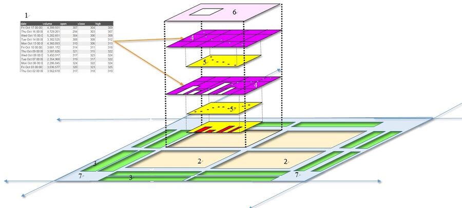
In AMI, charts are the graphical representation of data from one or more datamodels. Prior to creating charts, please refer to the Data Modeler section of the GUI Tools page in order to get a better understanding on the use of the data modeler and the creation of datamodels before creating charts. If you would like to get a quick overview on the process of creating charts, please review the Creating a Relationship Between Visualizations section of the GUI Getting Started page.
| 1 | Datamodel(s) | The data that is to be represented in the chart. The data can be from a data source or an object stored within AMI Center. A chart can have multiple datamodels |
| 2 | Plot | Area where the chart will be created |
| 3 | Axis | A set of data |
| 4 | Rendering layer | A 'slice' of the chart associated with a specific data model |
| 5 | Series | Reference lines tied to a series |
| 6 | Legend | A key to the series represented in the plot |
| 7 | User Control | Controls the transparency of all of the series in the chart |
A basic chart
Chart Basics
Plots
One or more plots can be added to a chart, forming a grid of plots. Each plot can contain any number of layers, stacked from front to back such that the front layer will obscure data from layers behind it, depending on the transparency of each layer. Once a chart has been created, additional plots can always be added to existing plots. There are two ways to add (or remove) plots.
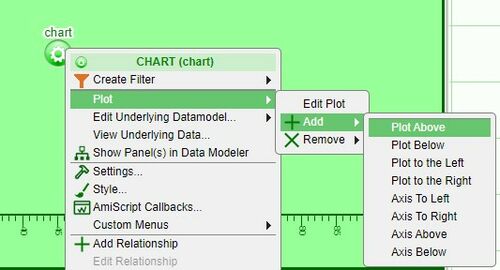
1. Click on the chart configuration button (green button) and select one of the options under Plot > Add (the options are above, below, to the left, or to the right)
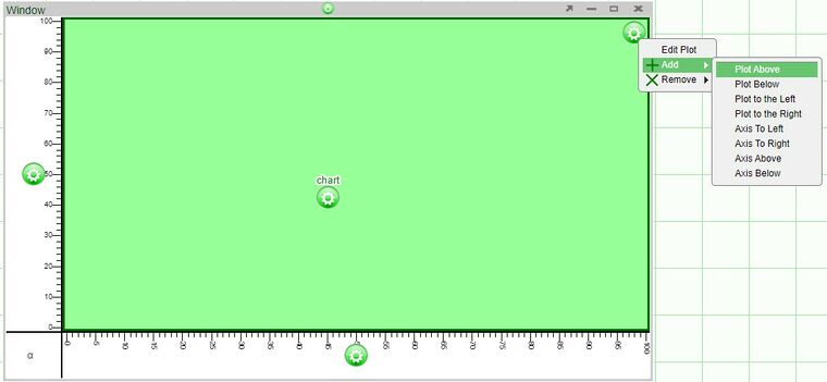
2. Click on the plot configuration button (located on the upper right corner of the plot) and select one of the options under Add
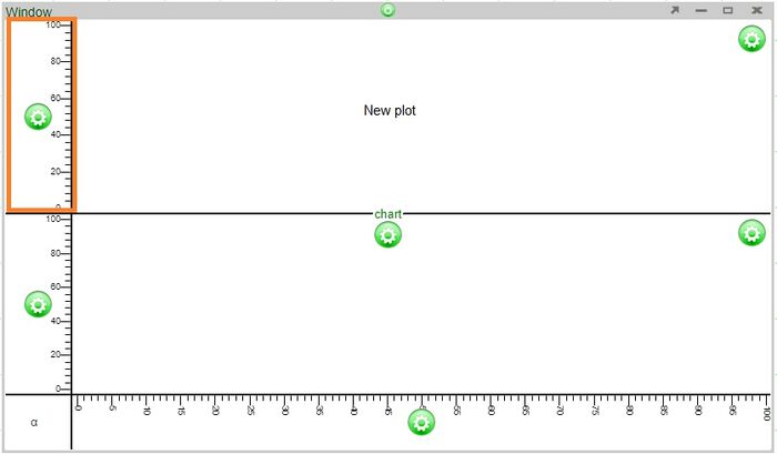
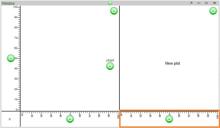
Axes will be added automatically to the new plots.
Examples
Adding a plot above will automatically add an axis to the left of the new plot (the two plots will share the same bottom axis)
Adding a plot to the right will automatically add an axis to the bottom of the new plot (the two plots will share the same left axis)
Additional points
- The size of each plot can be modified by adjusting the lines dividing the plots.
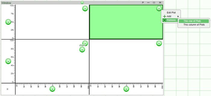
- When removing plots of 2x2 or larger, the options to remove plots will either be removing a row or plots or column of plots.
Axes
Any number of horizontal axes can be added to the top or bottom of a column of plots and any number of vertical axes can be added to the left or right of a row of plots. There are two ways to add additional axes to a chart.
1. As seen in the addition of plots, use the plot configuration button menu and select one of the options under Add (add to the left, right, above, or below).
2. Add axes directly to existing axes using the axis configuration button.
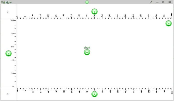
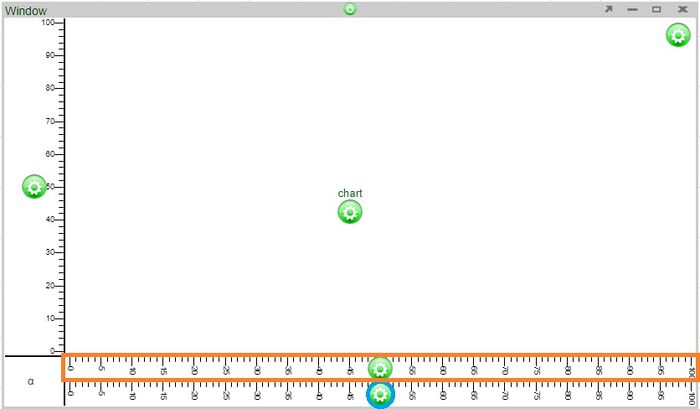
Examples - adding an axis above using the plot configuration button vs. adding an axis above an existing axis
Adding an axis above using the plot configuration button will add an axis above the plot
Adding an axis above using the axis configuration button (blue circle) added an axis directly above it (orange highlight)
Additional points
- When there are multiple plots used in a chart, new axes are added to the outside edges of the chart. For example, choosing to add an axis above on any of the plots in a column will add an axis to the very top of the chart. Choosing to add an axis to the right of any of the plots in a row will add an axis to the right edge of the chart.
Editing the Axis
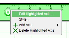
In order to add or modify a title of an axis, click on the axis configuration button and select Edit Highlighted Axis. In the Edit Axis window, you will be able to add a title using the Title field.
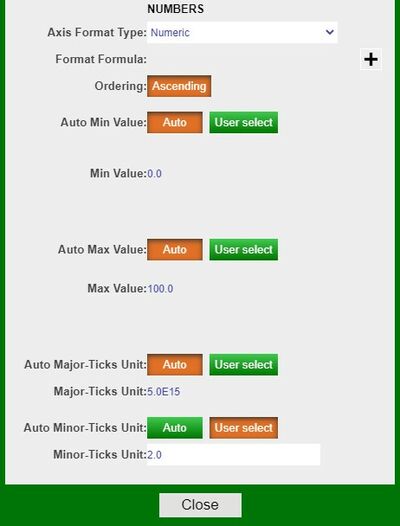
In this same Edit Axis window, you may also modify the format type of the axis. By default, the Auto setting is used when charts are made. However, you may select another format from the drop down (e.g., Numeric). Selecting a different format will enable the editing of the other fields in the window.
Layers
In order to render (display) the data model in the chart, a rendering layer must be added to the plot. Rendering layers (layers for short) allow the display of multiple charts on a single plot using the same or multiple data sets:
- If the data sets are to use the same axes, use a single layer with multiple series
- If the data sets are to use different axes, use multiple layers
- If two or more data models are used, you must use multiple layers
Adding a new layer manually
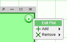
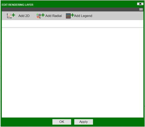
When you use the visualization wizard to create a new chart on a blank panel, layers will be automatically added. However, if you are working on a blank chart or you would like to add more layers to an existing chart, use the Edit Plot option found in the plot configuration menu. This will bring up the Edit Rendering Layer window.
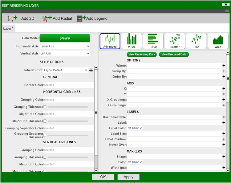
In the Edit Rendering Layer window, click on the Add 2D button to add a a new 2D chart layer.
- The Layer tab is divided with the Style Options on the left and the Chart Options on the right.
- In addition to the style options, the upper left contains the options to choose a datamodel for the layer and the ability to choose a horizontal/vertical axis (when working with multiple axes).
- Clicking on the datamodel button will open up the data modeler. When adding layers manually, it is better to have the datamodels prepared in advance.
- In the Chart Options side on the right, you have the different chart option tiles. These are the same tiles you will find in the visualization wizard when building charts. Switching between the tiles changes the relevant fields below (e.g., switching between the Scatter and Line tiles, you will notice that a Line Size(px) field is required.
- Use the Advanced tile in order to have the most control over the chart you would like to create. This tile will make all of the 2D chart fields available.
- After filling in the required fields, click Apply to create the layer
View Underlying Data and View Prepared Data
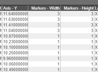
The View Underlying Data and View Prepared Data buttons found under the chart tiles can be used to quickly view the data that is to be used. The view underlying data will show the raw data from the datamodel, whereas the view prepared data will show the data after the fields are taken into account.
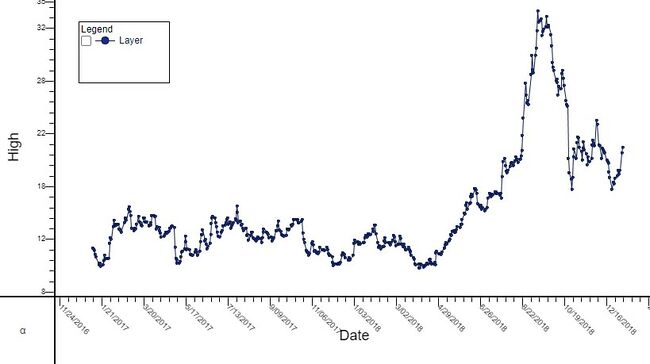
For example, I will make the Marker Size depend on the formula of (High > 11 ? 3 : 1). In the prepared data window, you can see that the marker sizes are 1 whenever the value of High (the Y axis) is less than 11.
Styles
Colors
In 2D/3D chart, after you have selected a visualization type, in the dropdown menu for Colors, you will encounter the following options:
No Color: self-explanatory.
Color: choose any color, by sampling or inputting the hex code in the color picker helper.
Formula: input a function that returns a color. ex: Population > 4000000? "#955e42":"#5603ad"
Series: input a function that returns a number. AMI will index it through the default collection of color and determine the color. The default color collection can be changed under Dashboard -> Style Manager -> Root -> Panel -> Chart -> Partition Colors, the list must contain valid hex codes and is comma delimited. ex: SurfaceArea+100
Gradient: input a variable that is numeric and AMI will vary the color intensity of the markers depending on the value with the default color spectrum. The color spectrum can be changed in Style Manager under Dashboard -> Style Manager -> Root -> Panel -> Chart -> Gradient Colors. ex: Population
Custom Series: same as Series except user must input a comma delimited list of hex codes in the second field, and input a function that returns a number in the third field. User may hardcode the number and that would mean only one color will be picked. ex: Field 2:#d78521,#ffa65c,#871303,#fff98a,#c40505,#80e8a6,#8e0073,#7df8ff,#068947,#c49fff Field 3:SurfaceArea
Custom Gradient: user-define color spectrum, otherwise same as Gradient.
3D Charts on AMI
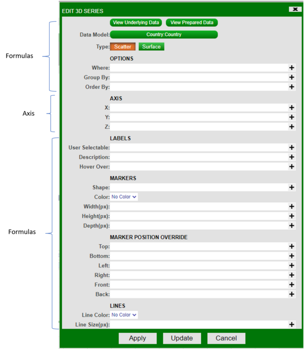
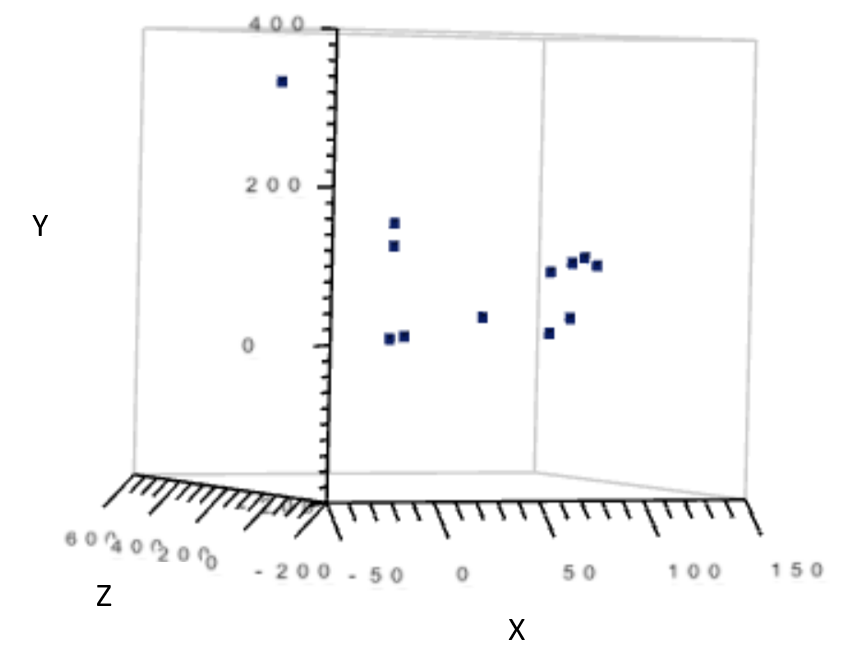
This document explains the usage of each field in a 3D chart. The fields are categorized into 3 sections: formulas, axis, styles. The order of the explanation in this document is based on the diagram below.
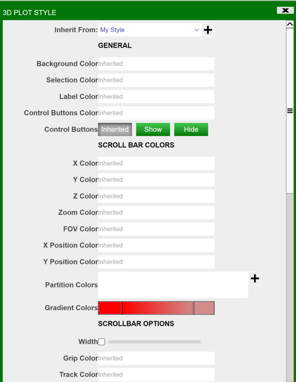
Below is all styles:
Formulas
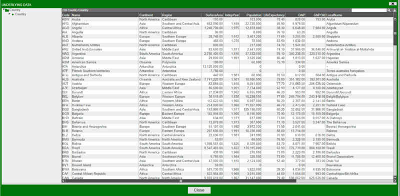
1. View Underlying data
Shows the data where the visualization is going to be based on. Example view below.
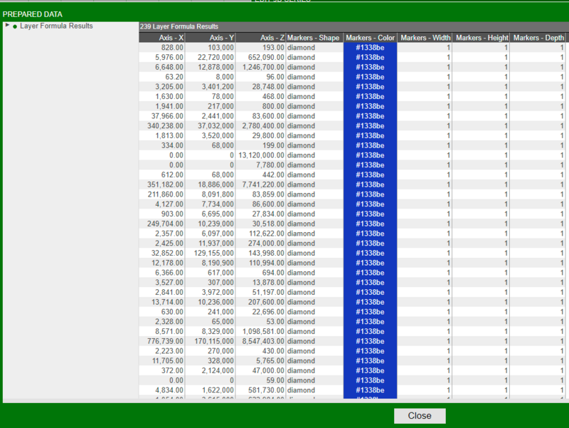
2. View Prepared data
Shows the underlying data as well as properties of the marker. Properties include:
- Marker Shape
- Marker Color
- Marker Width
- Marker Height
- Marker Depth
- Axis (coordinates) X/Y/Z
Example view below.
3. Data model
Shows the name of the datamodel of which the visualization is based on.
4. Type
Indicates whether the graph is a surface plot or a scatter plot.
Options
5. Where
Filters the data based on user-defined, semicolon delimited conditions. The graph would only show points which satisfies the boolean argument (e.g. suppose x-axis is “Quantity”. Inputting Quantity > 0 would cause the graph to only show points where Quantity > 0).
6. Group By
Affects the grouping in “View Prepared Data”.
7. Order By
Affects the ordering in “View Prepared Data”.
Axis
X/Y/Z Axis: required. Indicates what the coordinate values come from. Each axis takes a column’s name as input. Column data must be numeric.
Formulas
Labels
8. User Selectable
9. Description
Indicates what to annotate next to each data point on the chart.
10. Hover over
Indicates what to show when hovering over a data point.
Markers
11. Shape
Indicates the shape of each data point on the chart.
12. Color
Determines the color of each data point.
13. Width/Height/Depth (px)
Determines the size of the data points, in pixel, on the chart.
Marker Position Override
14. Top/Bottom/Left/Right/Front/Back
Forces each marker stretch to the specific value, relative to the range of X/Y/Z. Ex: if one of your markers has position (1x,2y,3z) and your graph has minimum Y value of -5 and maximum y value of 5, and you set Top as 5, then that marker will now stretch to (1x,5y,3z). The previous marker position is not erased so a line is formed, spanning from 2y to 5y. Setting a value outside of the current range will cause the marker line to go outside of the chart. Setting a negative value for Top is equivalent to setting a positive value for Bottom, vice versa. The same rule applies to Left/Right, Front/Back.
Lines
15. Line Color
Indicates the line color.
16. Line Size (px)
Indicates the line size, in pixel, connecting the data points.
Styles
1. Inherit From
Can be changed in Style Manager under Dashboard. This applies the selected styles from the Style Manager.
General
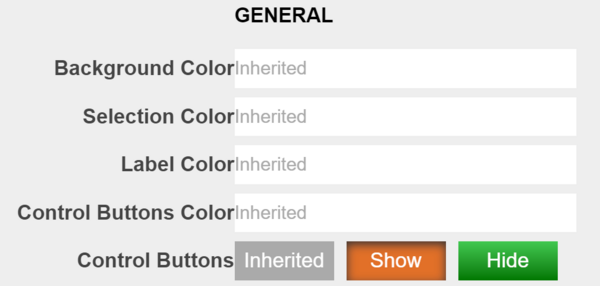
2. Background Color
Applies to the background of the visualization.
3. Selection Color
Affects the color you see when you select a data point on the chart.
4. Label Color
Affects the color of the labels on the bottom of the visualization. In the screenshot below I have changed the color of the labels to red.
5. Control Buttons Color
Affects the color of the buttons on the bottom left of the visualization as seen below.
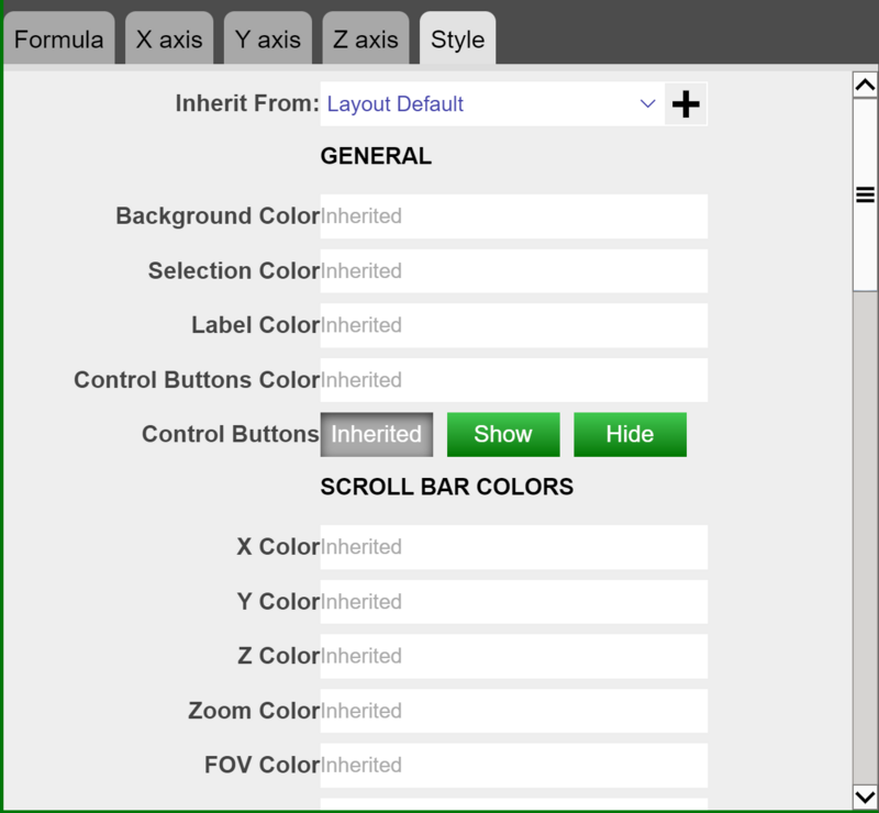
Scroll Bar Colors
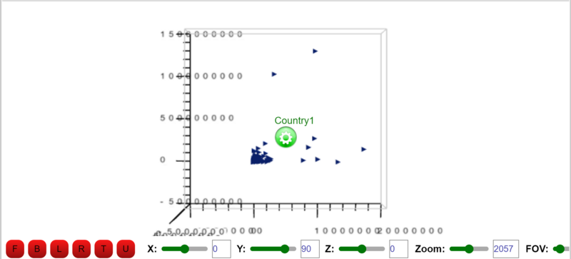
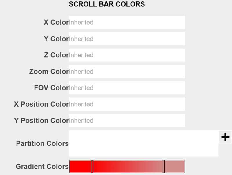
The colors here all refer to the scroll bars on the bottom of visualization, labeled “X”, “Y”, “Z”, “Zoom”, “FOV” and such.
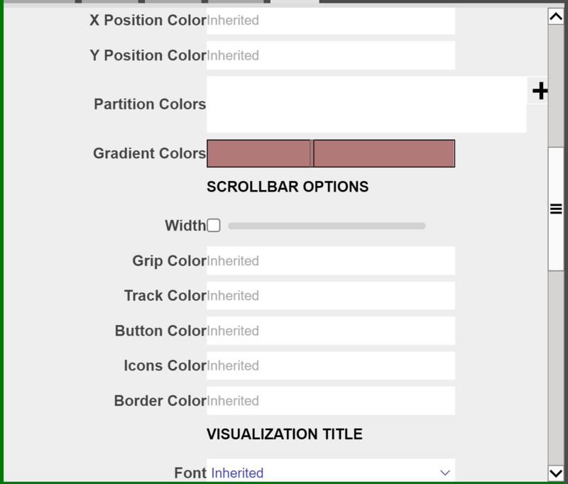
Scroll Bar Options
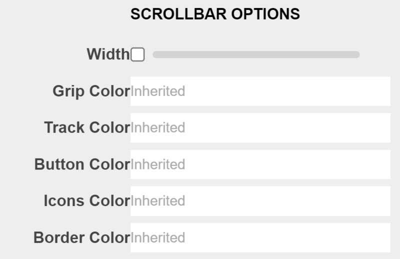
The options here all refer to the single scroll bar at the bottom of the visualization.
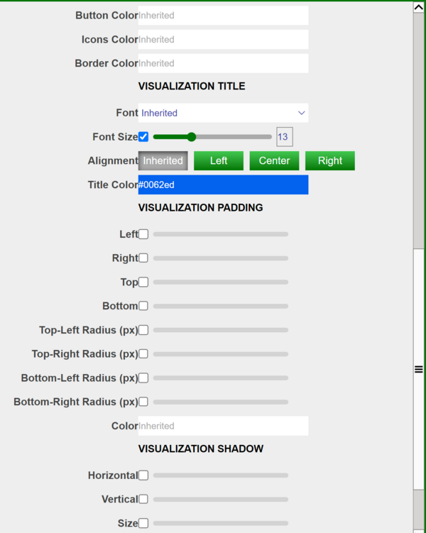
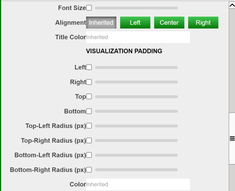
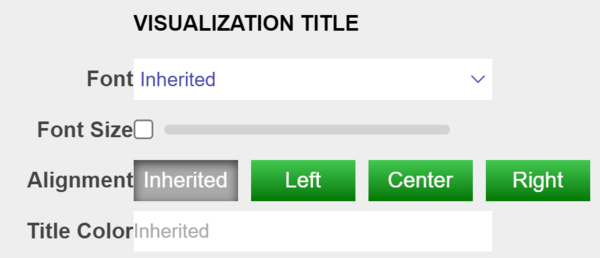
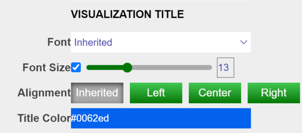
Visualization Title
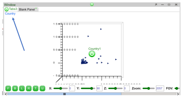
The options here control the title of the visualization. By default there is no title displayed on the chart. Below is an example usage
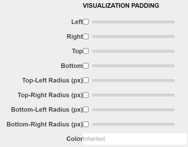
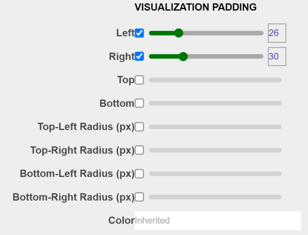
Visualization Padding
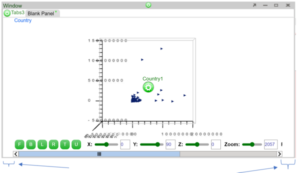
The options here control the padding of the visualization as a whole, the padding will cover the chart if set as a high value. Example usage below:
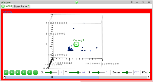
Visualization Border
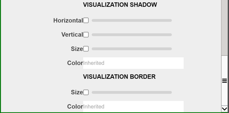
The bigger the size, the less space there is for the visualization, the bigger the borders. Color controls the border color. Example usage below
3D Charts PDF
Examples
Candlestick Chart
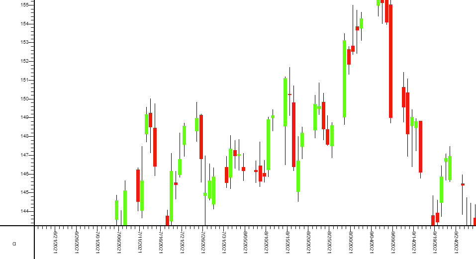
A candlestick chart can be built using AMI through the following steps.
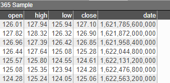
1. Create an empty 2D chart visualization on top of your datamodel, in this example, we are using the following Sample datamodel:
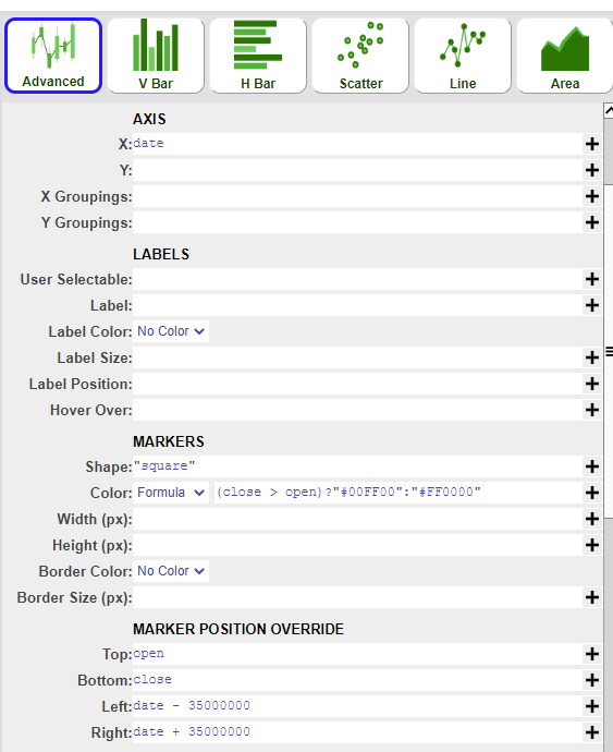
2. Using the advanced option, we will create the candle layer first with the following parameters:
| 1 | AXIS X | date |
| 2 | MARKERS Shape | “square” |
| 3 | MARKERS Color - Formula | (close > open ) ? “#00FF00” : “#FF0000” (Optional - to differentiate bars) |
| 4 | MARKER POSITION OVERRIDE Top | open |
| 5 | MARKER POSITION OVERRIDE Bottom | close |
| 6 | MARKER POSITION OVERRIDE Left | date - 35000000 |
| 7 | MARKER POSITION OVERRIDE Right | date + 35000000 |
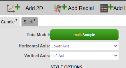
3. Add a new layer on top of the chart (stick layer):
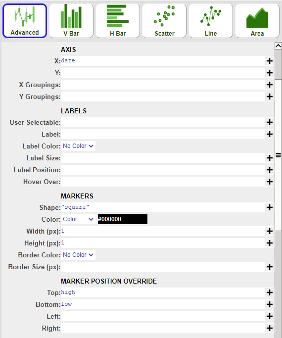
4. Using the advanced option as well, create the stick layer with the following parameters:
| 1 | AXIS X | date |
| 2 | MARKERS Shape | “square” |
| 3 | MARKERS Color - Color | #000000 |
| 4 | MARKERS - Width | 1 |
| 5 | MARKERS - Height | 1 |
| 6 | MARKER POSITION OVERRIDE Top | high |
| 7 | MARKER POSITION OVERRIDE Bottom | low |
OHLC Chart
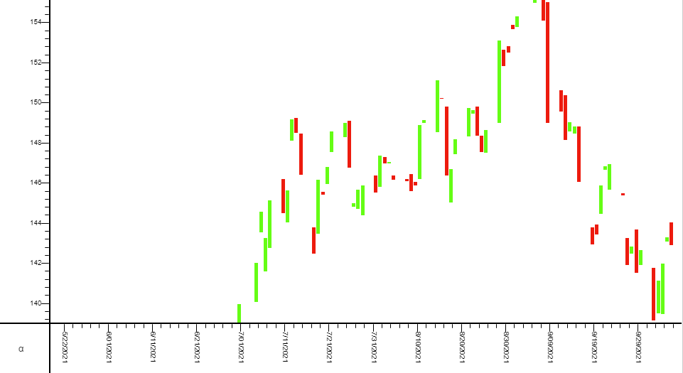
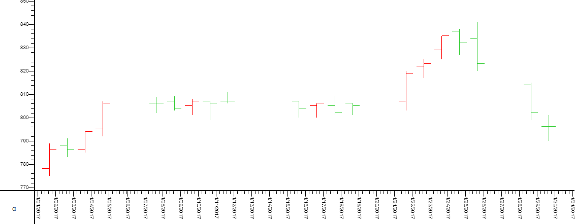
OHLC (open-high-low-close) chart consists of:
- a vertical line that represents the intraday range for the period
- a horizontal line extending to the left that represents the opening price for the period
- a horizontal line extending to the right that represents the closing price for the period
It can be built using AMI through the following steps:
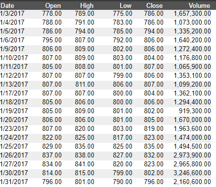
1. Create an empty 2D chart visualization on top of your datamodel, in this example, we are using the following Sample datamodel:
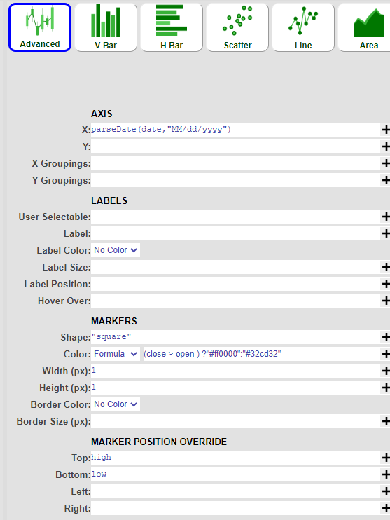
2. Using the advanced chart option, we will create the intraday range (vertical line) layer first with the following parameters:
| 1 | AXIS X | date (or use the parseDate() formula if the date field is a string ) |
| 2 | MARKERS Shape | “square” |
| 3 | MARKERS Color - Formula | (close > open ) ?"#ff0000":"#32cd32" |
| 4 | MARKERS - Width | 1 |
| 5 | MARKERS - Height | 1 |
| 6 | MARKER POSITION OVERRIDE Top | high |
| 7 | MARKER POSITION OVERRIDE Bottom | low |
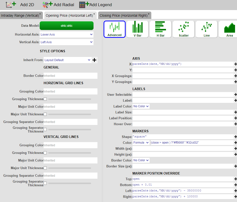
3. Click on 'Add 2D' and add a new layer on top of the chart. (Opening Price - Horizontal Left Line layer)
4. Using the advanced option as well, create the Opening Price layer with the following parameters:
| 1 | AXIS X | date (or use the parseDate() formula if the date field is a string ) |
| 2 | MARKERS Shape | “square” |
| 3 | MARKERS Color - Formula | (close > open ) ?"#ff0000":"#32cd32" |
| 4 | MARKER POSITION OVERRIDE Top | open |
| 5 | MARKER POSITION OVERRIDE Bottom | open + 0.01 |
| 6 | MARKER POSITION OVERRIDE Left | date - 35000000 |
| 7 | MARKER POSITION OVERRIDE Right | date + 100000 |
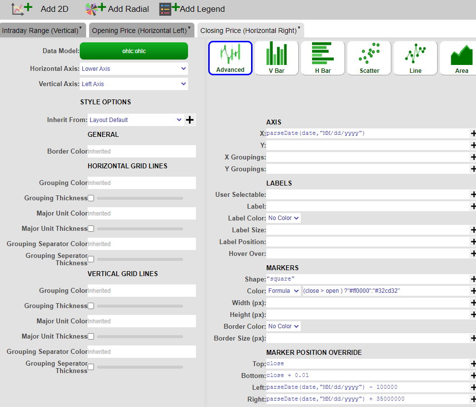
4. Click on 'Add 2D' and add the 3rd layer (Closing Price - Horizontal Right Line layer). Using the advanced option as well, create the Closing Price layer with the following parameters:
| 1 | AXIS X | date (or use the parseDate() formula if the date field is a string ) |
| 2 | MARKERS Shape | “square” |
| 3 | MARKERS Color - Formula | (close > open ) ?"#ff0000":"#32cd32" |
| 4 | MARKER POSITION OVERRIDE Top | close |
| 5 | MARKER POSITION OVERRIDE Bottom | close + 0.01 |
| 6 | MARKER POSITION OVERRIDE Left | date - 100000 |
| 7 | MARKER POSITION OVERRIDE Right | date + 35000000 |
5. Click on 'Apply' and 'OK' and you have successfully created an OHLC chart.
Realtime Chart
If we subscribe our datamodeller with its own feed, we would make it a realtime datamodeller which we can be used to create a realtime chart.
1. Suppose we have a real time table(feed) called "testTime", right click on the feed -> Add Datamodel

2. Now that the datamodeller subscribes to its own feed, we could configure the datamodeller based on the realtime feed. In this example, we want to get every other id value
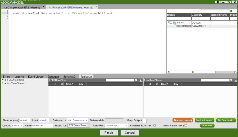
3. Right click on the Datamodeller icon -> Add Table/Visualization Form -> Select a table in your chosen datamodeller
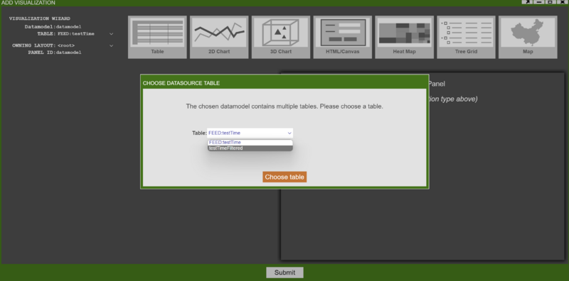
4. Choose any chart type of your interest. Here we choose a bar chart.
5. Edit the plot configuration -> submit. We have a realtime bar chart ready to go.
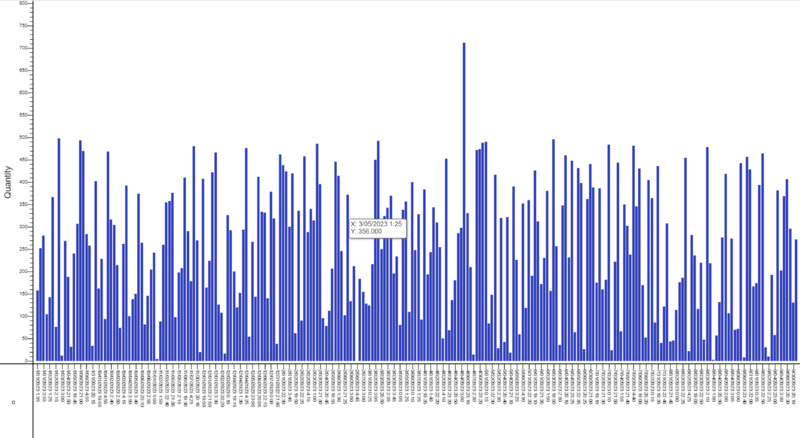
The above chart is redrawn on every update in the feed that the realtime datamodel is based on.
Alternatively, if rerunning the datamodel on every update is very expensive, it is possible to have the datamodel conflate its runs. This will make it so that it runs only once in the specified time period. This can be controlled by the Conflate Run (sec) field in the Edit Datamodel window.
Hollow Pie Chart
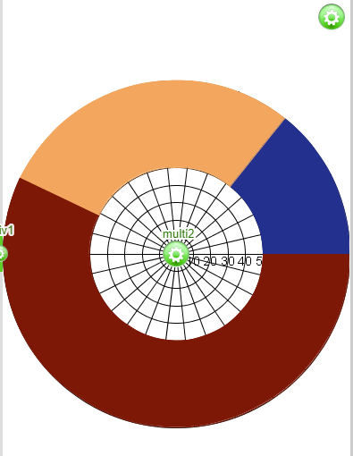
Assume we want to create a hollow pie chart out of our sample table Sample(Symbol String, Quantity Int).
1. Select our datamodel -> 2D Chart -> Pie Chart:
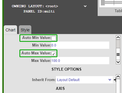
2. Uncheck Auto Min Value and Auto Max Value
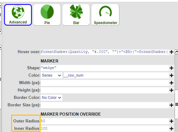
3. go to Advanced -> Marker Position Override -> set your inner/outer radius
4. Final Hollow Pie Chart:
Moving Average Chart
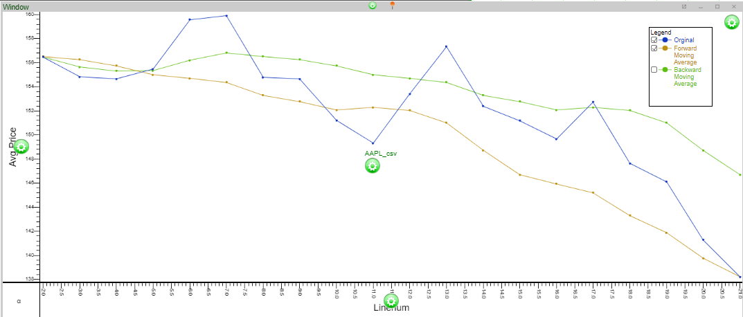
In this example, we are using some sample stock data to demonstrate the moving average chart.
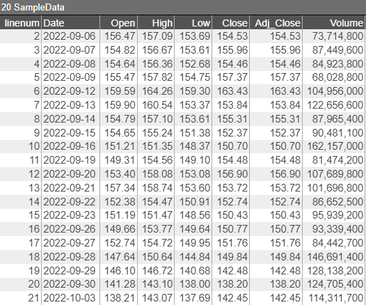
In the table SampleData we have 20 days of stock data and we are going to create a seven-day moving average out of `Open`.
 int movingAvgWin=7;

//forward Moving Average
  CREATE TABLE ForwardMovingAvgPrice as ANALYZE Date, Open,avg(win.Open) AS avg_price FROM SampleData WINDOW
  win ON win.linenum <= linenum + ${movingAvgWin}-1 && linenum <= win.linenum;

//backward Moving Average
  CREATE TABLE BackwardMovingAvgPrice as ANALYZE Date, Open,avg(win.Open) AS avg_price FROM SampleData WINDOW
  win ON win.linenum <= linenum  && linenum - ${movingAvgWin}+1 <= win.linenum;
Correlation Heatmap
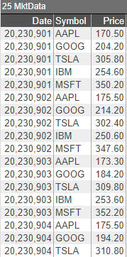
1. Let's use the data below to create a simple correlation heatmap over the prices of different symbols over 5 days
 create table MktData(Date Long, Symbol String, Price double);
insert into MktData values(20230901,"AAPL",170.5),(20230901,"GOOG",204.2),(20230901,"TSLA",305.8),(20230901,"IBM",254.6),(20230901,"MSFT",350.2),
                          (20230902,"AAPL",175.5),(20230902,"GOOG",214.2),(20230902,"TSLA",302.4),(20230902,"IBM",250.6),(20230902,"MSFT",347.6),
                          (20230903,"AAPL",173.3),(20230903,"GOOG",184.2),(20230903,"TSLA",309.8),(20230903,"IBM",253.6),(20230903,"MSFT",352.2),
                          (20230904,"AAPL",175.5),(20230904,"GOOG",194.2),(20230904,"TSLA",310.8),(20230904,"IBM",254.1),(20230904,"MSFT",345.2),
                          (20230905,"AAPL",172.9),(20230905,"GOOG",202.2),(20230905,"TSLA",315.8),(20230905,"IBM",254.5),(20230905,"MSFT",359.2);
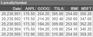
list symbols = select Symbol from MktData group by Symbol;
list dates = select Date from MktData group by Date;
String columnNameSchema = "Date Long, " + strJoin(" double, ",symbols)+" double";

create table priceBySymbol(${columnNameSchema});

for(int i=0;i<dates.size();i++){
  string insertval = "";
  double date = dates.get(i);
  insertval+="${date}";
  for(int j=0;j<symbols.size();j++){
    string sym = symbols.get(j);
    double px = select Price from MktData where Date==date and Symbol == sym;
    insertval+=","+"${px}";
  }
  insert into priceBySymbol values(${insertval});
}
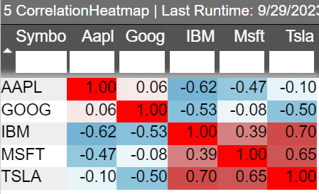
3. Generate the heatmap schema and initialize
string MatrixSchema = "Symbol String, "+ strJoin(" double, ",symbols)+ " double";
create table CorrelationHeatmap(${MatrixSchema});


  //3.1. initialize the values
for(string sym:symbols){
  insert into CorrelationHeatmap values("${sym}",null,null,null,null,null);
  //3.2 set the values on the diagonal to 1
  update CorrelationHeatmap set ${sym}=1.00 where Symbol=="${sym}";
}
4. Get all pairs of Symbols
set allPairsOfSyms = new set();
for(int i=0;i<symbols.size();i++){
  for(int j=0;j<symbols.size();j++){
    if(i!=j)
      allPairsOfSyms.add(new set(symbols.get(i),symbols.get(j)));
  }
}
5. iterate over each pair of Symbols and calculate the correlation index
for(set pair: allPairsOfSyms){
  list sortedPair = pair.sort();
  string sym1 = sortedPair.get(0);
  string sym2 = sortedPair.get(1);
  double cov =select covar(${sym1},${sym2}) from priceBySymbol;
  double stdevProduct = select stdev(${sym1})*stdev(${sym2}) from priceBySymbol;
  double correlation_coeff=cov/stdevProduct;
  update CorrelationHeatmap set ${sym1}=correlation_coeff where Symbol=="${sym2}";
  update CorrelationHeatmap set ${sym2}=correlation_coeff where Symbol=="${sym1}";
}
