Difference between revisions of "Support FAQ"
(Adding new section - Inserting Data from Datamodel to AMI DB) |
|||
| Line 62: | Line 62: | ||
{ | { | ||
CREATE TABLE Country AS USE EXECUTE SELECT * FROM `Country` WHERE ${WHERE}; | CREATE TABLE Country AS USE EXECUTE SELECT * FROM `Country` WHERE ${WHERE}; | ||
| − | string s = SELECT SQL from DESCRIBE | + | string s = SELECT SQL from DESCRIBE TABLE Country; |
s = strReplace(s, "CREATE TABLE", "CREATE PUBLIC TABLE IF NOT EXISTS"); | s = strReplace(s, "CREATE TABLE", "CREATE PUBLIC TABLE IF NOT EXISTS"); | ||
// session.log(s); | // session.log(s); | ||
Revision as of 12:55, 21 April 2022
Plotting Bar Chart Side-by-Side
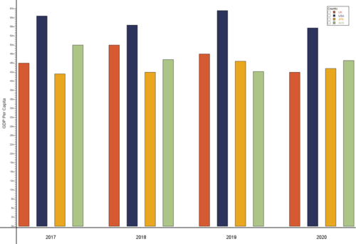
In this example, we will be plotting a grouped bar chart to show the GDP per capita for UK, USA, JPN and AUS between 2017 and 2020. The result looks as such:
To start off with, create a Datamodel with the code snippet below. Once we have a table with our data, in this case GDPPerCapita table we need to prepare the dataset to plot the data. The following code snippet prepares the data by creating a table called GDPPerCapitaPlot.
{
 create table GDPPerCapita (Year string, UK double, USA double, JPN double, AUS double);
 insert into GDPPerCapita values ("2017", 45000, 58000, 42000, 50000);
 insert into GDPPerCapita values ("2018", 50000, 55500, 42500, 46000);
 insert into GDPPerCapita values ("2019", 47500, 59500, 45500, 42700);
 insert into GDPPerCapita values ("2020", 42500, 54700, 43500, 45700);

 Table t = select * from GDPPerCapita;
 List yearList = select Year from GDPPerCapita;
 List valTypesList = t.getColumnNames();
 valTypesList.remove(t.getColumnLocation("Year"));

 create table GDPPerCapitaPlot (Year string, valType string, x double, val double);

 int n = 1;
 for (int i = 0; i < yearList.size(); i++) {
    Row r = t.getRow(i);
    string Year = r.get("Year");
    double ld = 0.0;
    int cnt = 0;
    for (string valType : valTypesList) {
      double val = r.get(valType);
      insert into GDPPerCapitaPlot values (Year, valType, n, val);
      ld += n;
      n += 1;
      cnt += 1;
    }
    ld = ld / cnt;
    insert into GDPPerCapitaPlot values (Year, "label", ld, 1.0);
    n+=1;
  }
}
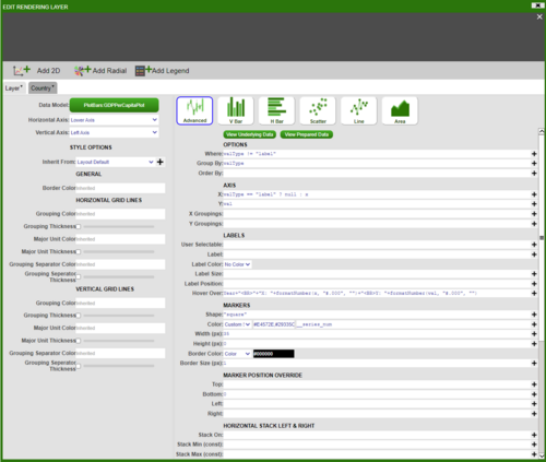
Next, we will add a visualisation to the Datamodel on the GDPPerCapitaPlot table. Choose the ‘2D Chart’ – ‘Advanced’, and fill in the options as below (For ‘Color’ in ‘MARKERS’ section choose Custom_Series and add series of colours in hex code for example ‘#E4572E,#29335C,#F3A712,#A8C686,#669BBC’):
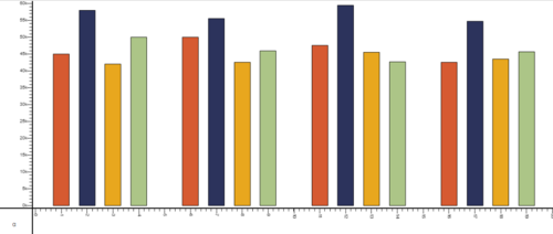
This will give us the following bar plot:
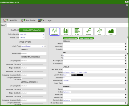
To add axis and get the final result, add a panel below the bar chart, then add a visualisation based on GDPPerCapitaPlot table with the following information:
Editing and styling the axis and the divider gives us the desired chart.
Inserting Data from Datamodel to AMI DB
The table Country exists in a datasource called WORLD. We want to take this table and create a copy of it in AMI datasource. To create a copy of the Country table, we need the schema which we get using the DESCRIBE clause.
{
  CREATE TABLE Country AS USE  EXECUTE SELECT * FROM `Country` WHERE ${WHERE};
  string s = SELECT SQL from DESCRIBE TABLE Country;
  s = strReplace(s, "CREATE TABLE", "CREATE PUBLIC TABLE IF NOT EXISTS");
  // session.log(s);
  USE ds="AMI" LIMIT = -1 EXECUTE ${s};
  // USE ds="AMI" EXECUTE DELETE FROM Country;
  USE ds="AMI" INSERT INTO Country FROM SELECT * FROM Country;
}


