Difference between revisions of "GUI Charts"
| Line 81: | Line 81: | ||
===Editing the Axis=== | ===Editing the Axis=== | ||
| + | In order to add or modify a title of an axis, click on the axis configuration button and select '''Edit Highlighted Axis'''. In the Edit Axis window, you will be able to add a title using the '''Title''' field. | ||
| + | |||
| + | [[File:GUI.Charts.13.jpg]] | ||
| + | |||
| + | [[File:GUI.Charts.14.jpg|400px]] | ||
| + | |||
| + | In this same Edit Axis window, you may also modify the '''format type''' of the axis. By default, the '''Auto''' setting is used when charts are made. However, you may select another format from the drop down (e.g., Numeric). Selecting a different format will enable the editing of the other fields in the window. | ||
| + | |||
| + | [[File:GUI.Charts.15.jpg|400px]] | ||
Revision as of 05:11, 13 April 2021
Intro to Charts
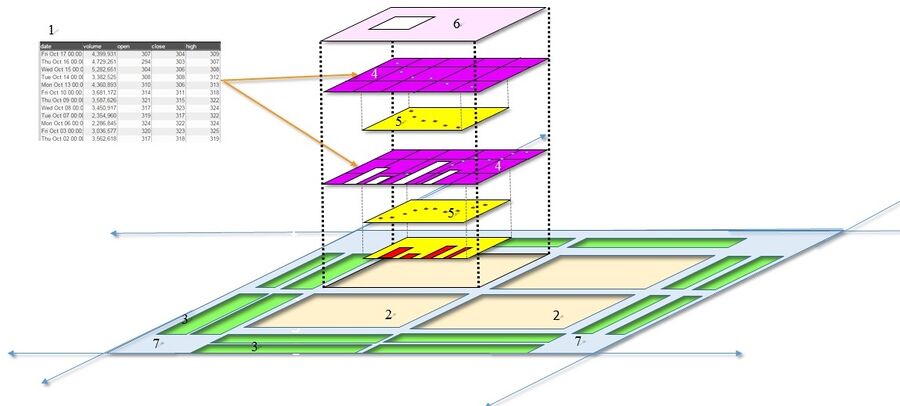
In AMI, charts are the graphical representation of data from one or more datamodels. Prior to creating charts, please refer to the Data Modeler section of the GUI Tools page in order to get a better understanding on the use of the data modeler and the creation of datamodels before creating charts. If you would like to get a quick overview on the process of creating charts, please review the Creating a Relationship Between Visualizations section of the GUI Getting Started page.
| 1 | Datamodel(s) | The data that is to be represented in the chart. The data can be from a data source or an object stored within AMI Center. A chart can have multiple datamodels |
| 2 | Plot | Area where the chart will be created |
| 3 | Axis | A set of data |
| 4 | Rendering layer | A 'slice' of the chart associated with a specific data model |
| 5 | Series | Reference lines tied to a series |
| 6 | Legend | A key to the series represented in the plot |
| 7 | User Control | Controls the transparency of all of the series in the chart |
A basic chart
Chart Basics
Plots
One or more plots can be added to a chart, forming a grid of plots. Each plot can contain any number of layers, stacked from front to back such that the front layer will obscure data from layers behind it, depending on the transparency of each layer. Once a chart has been created, additional plots can always be added to existing plots. There are two ways to add (or remove) plots.
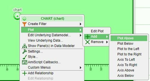
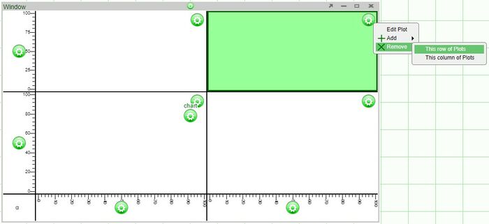
1. Click on the chart configuration button (green button) and select one of the options under Plot > Add (the options are above, below, to the left, or to the right)
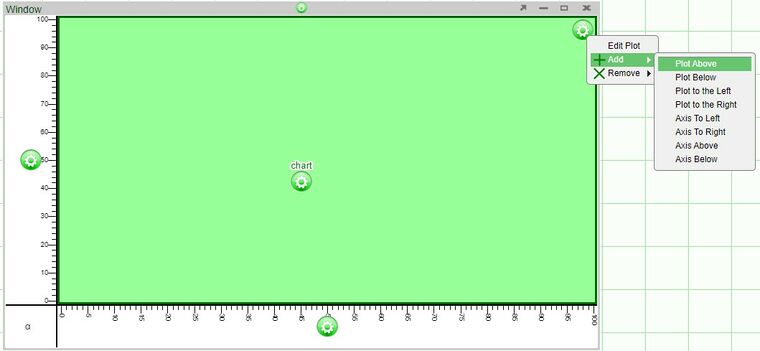
2. Click on the plot configuration button (located on the upper right corner of the plot) and select one of the options under Add
Axes will be added automatically to the new plots.
Examples
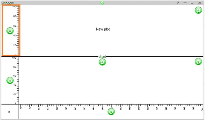
Adding a plot above will automatically add an axis to the left of the new plot (the two plots will share the same bottom axis)
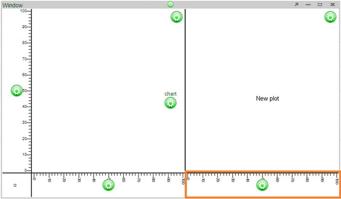
Adding a plot to the right will automatically add an axis to the bottom of the new plot (the two plots will share the same left axis)
Additional points
- The size of each plot can be modified by adjusting the lines dividing the plots.
- When removing plots of 2x2 or larger, the options to remove plots will either be removing a row or plots or column of plots.
Axes
Any number of horizontal axes can be added to the top or bottom of a column of plots and any number of vertical axes can be added to the left or right of a row of plots. There are two ways to add additional axes to a chart.
1. As seen in the addition of plots, use the plot configuration button menu and select one of the options under Add (add to the left, right, above, or below).
2. Add axes directly to existing axes using the axis configuration button.
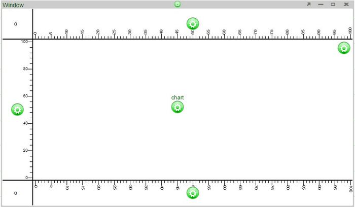
Examples - adding an axis above using the plot configuration button vs. adding an axis above an existing axis
Adding an axis above using the plot configuration button will add an axis above the plot
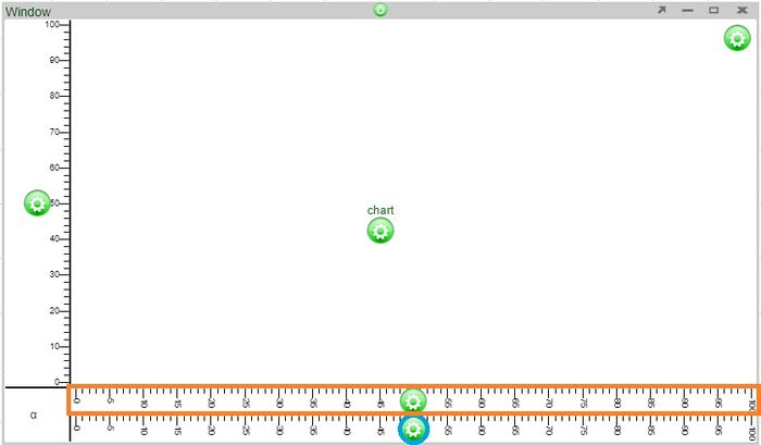
Adding an axis above using the axis configuration button (blue circle) added an axis directly above it (orange highlight)
Additional points
- When there are multiple plots used in a chart, new axes are added to the outside edges of the chart. For example, choosing to add an axis above on any of the plots in a column will add an axis to the very top of the chart. Choosing to add an axis to the right of any of the plots in a row will add an axis to the right edge of the chart.
Editing the Axis
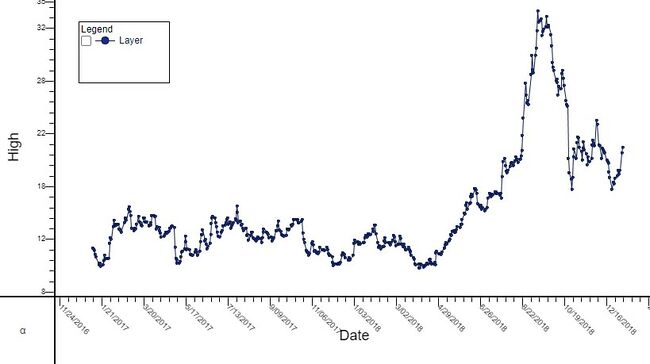
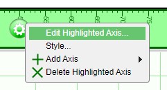
In order to add or modify a title of an axis, click on the axis configuration button and select Edit Highlighted Axis. In the Edit Axis window, you will be able to add a title using the Title field.
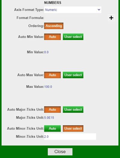
In this same Edit Axis window, you may also modify the format type of the axis. By default, the Auto setting is used when charts are made. However, you may select another format from the drop down (e.g., Numeric). Selecting a different format will enable the editing of the other fields in the window.
